


Forever Appoints Tendril Co-Founder Chris Bahry as CEO
July 22, 2026
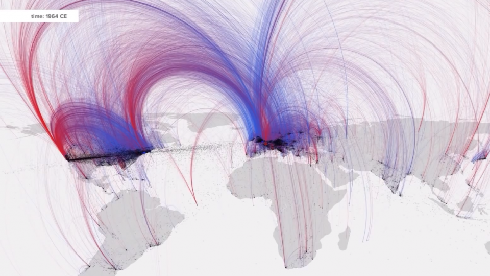
If you appreciate the power of data-driven animation, you’ll love this new view of history tracking the births and deaths of 120,000 people from 600 BC to the present day: “using them as a proxy for skills and ideas, the map reveals intellectual hotspots and tracks how empires rise and crumble.”
Created by Maximilian Schich at the University of Texas at Dallas and Mauro Martino at IBM and based on data retrieved from Freebase, a database of people, places, and things owned by Google.
As suspected, Florida is indeed where people go to die.
Check out the full story behind the project here.