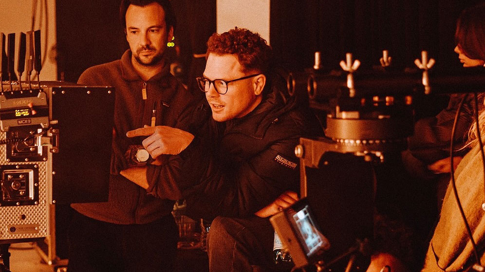
Niceshit Celebrates a Decade of Design & Motion With Rebrand and Hand-Made Font

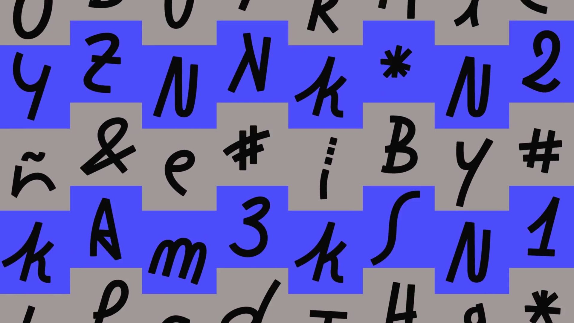
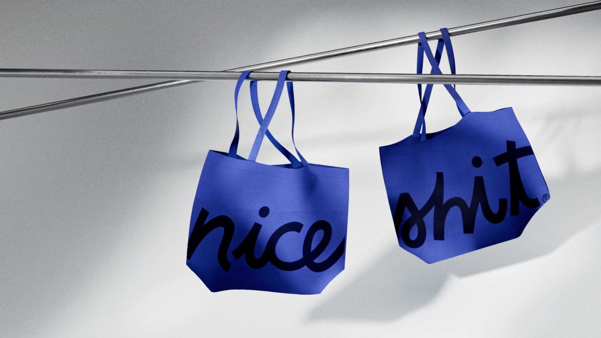
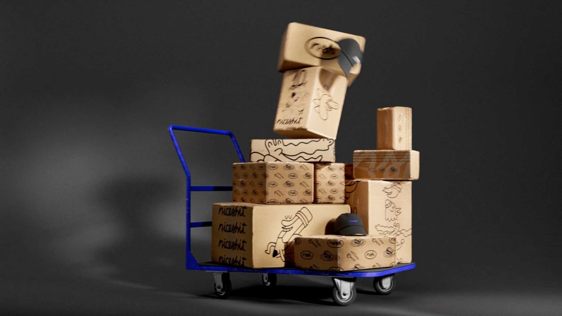
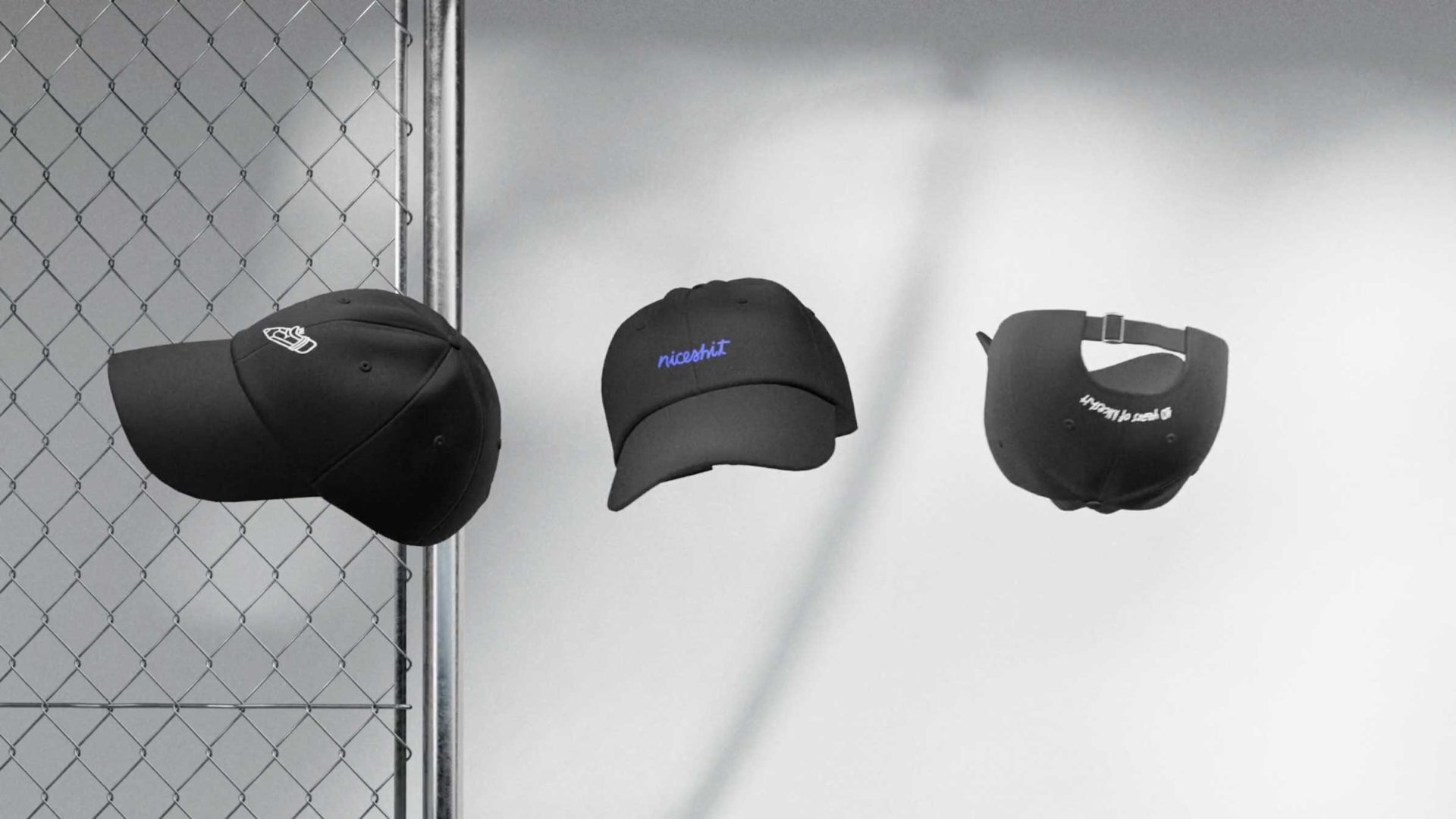
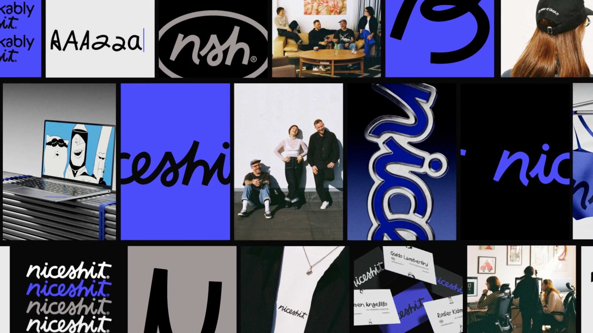
The crew at Niceshit Studio in Barcelona mark their 10th anniversary in the animation/illustration trade with a full rebrand anchored by a custom, hand-drawn typeface built from the handwriting of the studio’s three founders.

Co-founder’s Carmen Angelillo, Guido Lambertini, Rodier Kidmann: “Three directors, one font. It’s a fitting choice for a studio that has always believed ideas come before drawings — that the concept has to earn the visual, not the other way around.

“We’ve spent a decade designing illustrated worlds in motion for major brands while holding onto three things: simplicity, humor, and function. The new identity is the clearest expression yet of all of that.”
 

Images

 
A digital pattern inspired by the Niceshit Studio rebrand 2026, featuring black symbols, letters, and numbers in different fonts scattered over a background of alternating blue and gray rectangular shapes. Frame from Stash Magazine article.

Two blue tote bags hang on metal rods. One bag has the word “nice” in bold black script, and the other has the word “shit” in the same style. The bags cast soft shadows on a white background. Frame from Stash Magazine article.

A blue hand truck loaded with several cardboard boxes, some decorated with doodles and patterns, against a plain dark background. One box is tipping or falling from the top of the stack. Frame from Stash Magazine article.

Three black baseball caps are displayed against a light background next to a chain-link fence. Each cap shows different text or designs, with one cap facing forward, one at an angle, and one showing the back. Frame from Stash Magazine article.

A collage features people posing, bold handwritten and graphic niceshit text, unique fonts, clothing, and design elements in black, white, and blue. Some scenes include groups sitting together and product images. Frame from Stash Magazine article.
 

Credits

 
Production: Niceshit Studio