

MakeMake Appoints Alex McDowell, RDI, as Director of New Narrative Design Department
July 17, 2026
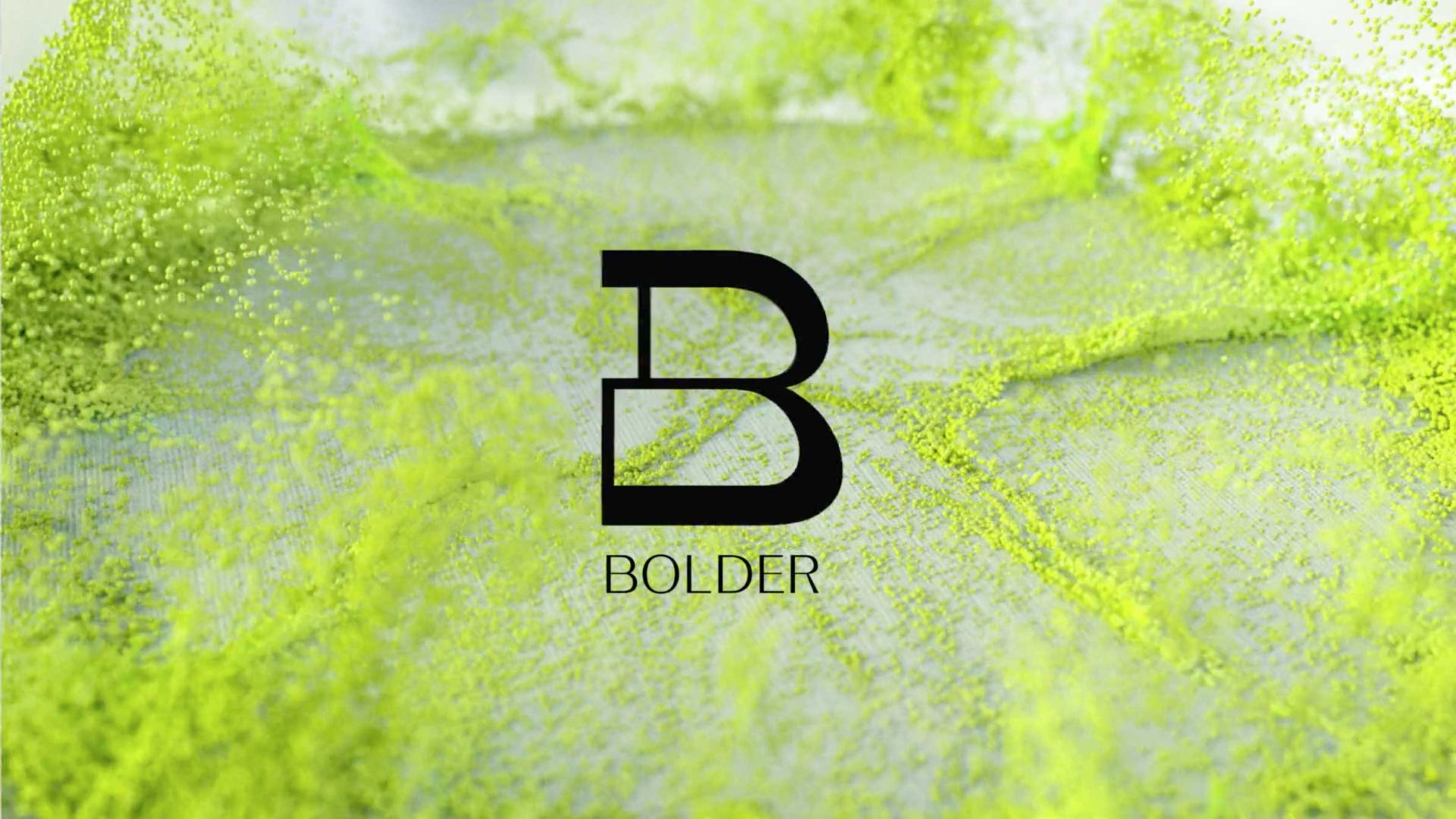
The team at London 3D and motion house Bolder are rightfully celebrating 20 years in a tough business with an ambitious rebrand in collab with UK studio Monday Nights and anchored by these launch and manifesto films.
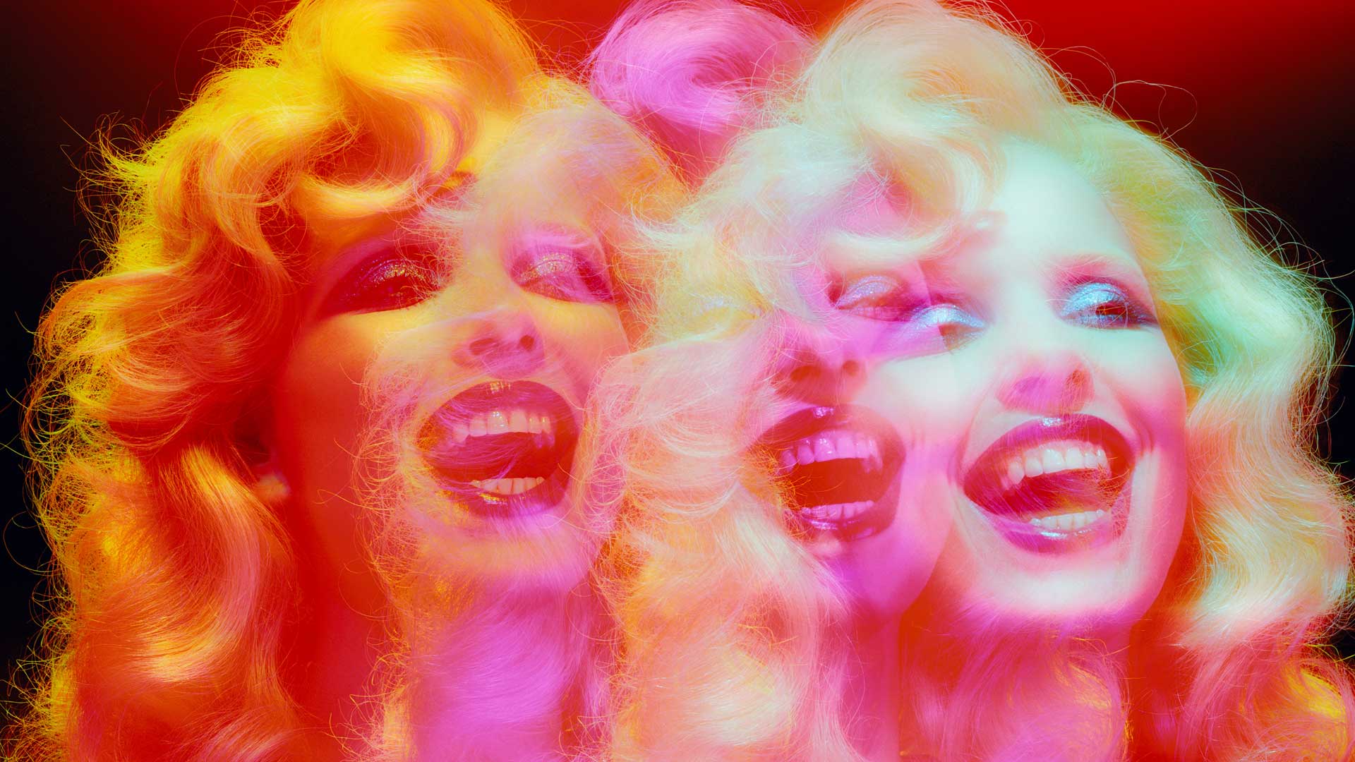
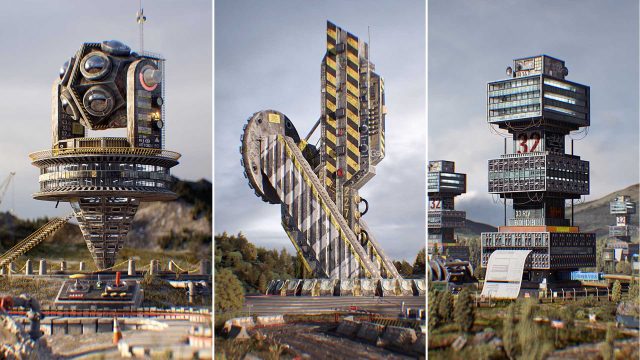
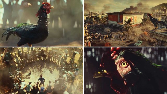
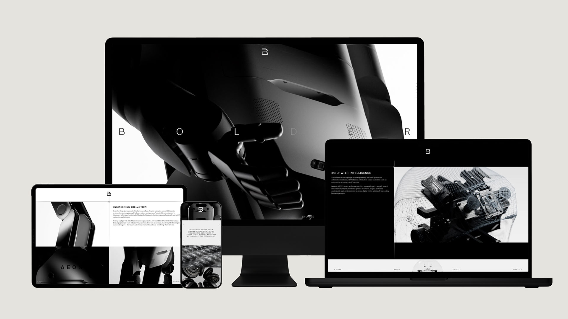
Dave Farquharson, CD at Bolder: “The way we work as a studio is inherently varied, different techniques, aesthetics and approaches depending on the brief. It felt important that our manifesto film reflected that honestly, rather than forcing everything into a single visual style.
“The goal was to create something visually rich that reflected both our technical craft and the personality of the studio. There’s a satisfying tension throughout the film between sophistication and playfulness, precision and spontaneity. That balance feels important to us.
“There’s a satisfying tension throughout the film between sophistication and playfulness, precision and spontaneity.”
“The work we love most often lives in that space, where technical execution and creative instinct elevate each other, and the tools we use enable self-expression. This wasn’t about making a rebrand film that talked about creativity. It was about creating something that genuinely came from it.
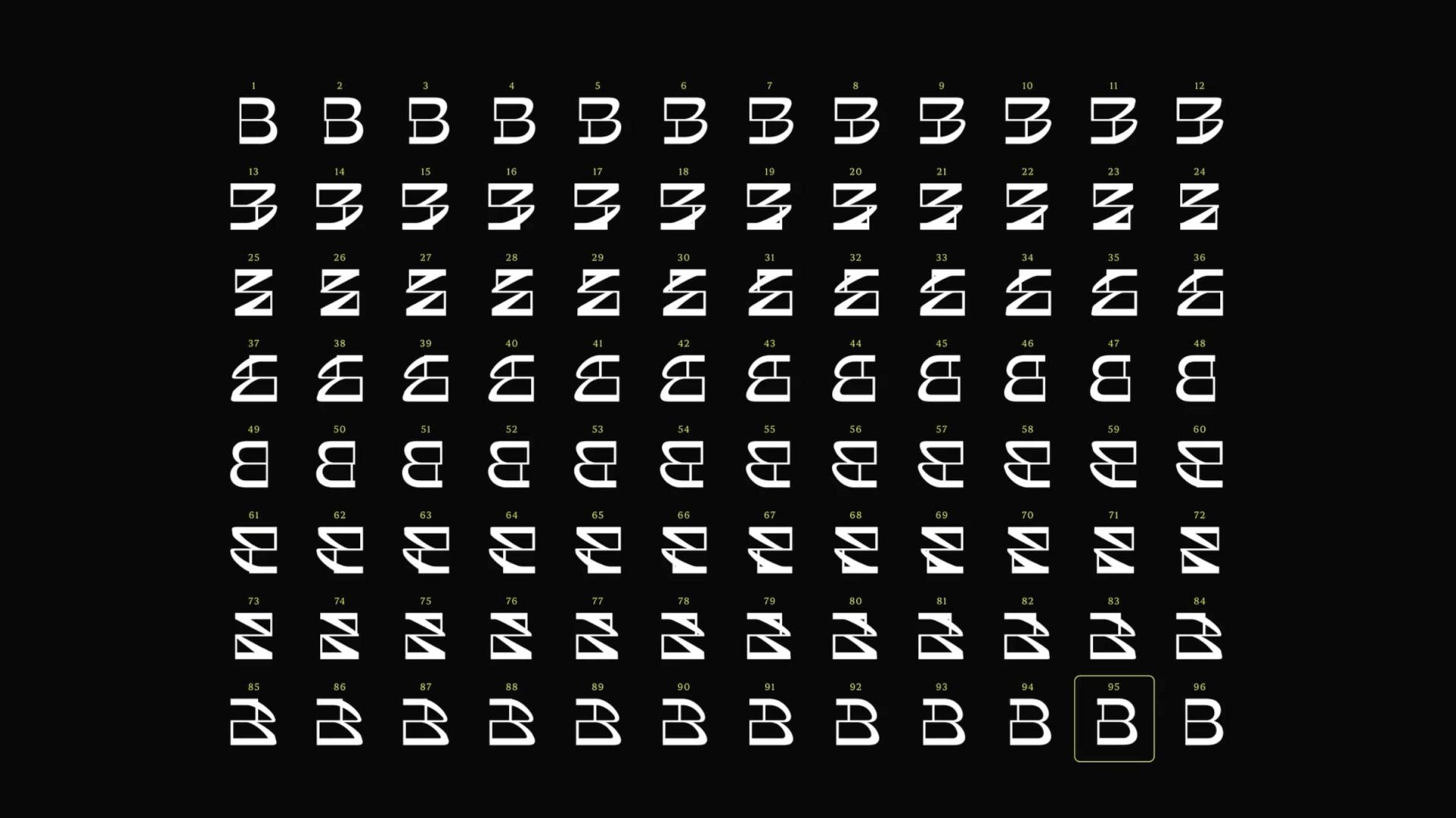
“The new Bolder logo was created to exist in its animated form as often as possible, however to land on our logo mark one ‘hero’ frame had to be chosen. A high frame rate output of the rotating logo structure was created in its graphic/silhouette form and a specific frame was selected.
“A frame that is recognizable as the wordmark-based B but with a fleeting moment’s worth of rotation, creating a subtle offset in its shape, producing a design detail that hints at the idea of motion and forward movement.”

Production: Bolder
Director: Bolder
CD: Dave Farquharson
Identity Design: Monday Nights
Audio: Sound Canvas