
French Directing Collective Meat Dept. Joins Psyop Roster
March 30, 2026
UK design mavens DixonBaxi wrap a six-month quest to reinvent A+E’s History Channel while developing “a potent new brand strategy and comprehensive design language that challenges what the brand is, how it is perceived and to inspire the restless explorer in everyone.”
“We began with strategic sprints to reshape the brand and take ownership of the super genre through ‘humanity’s defining stories’. Moving beyond just TV content to create a broader definition of History we refined the brand hierarchy, strategic and visual relationships and helped to create thematic strands to frame content across all of their platforms.
“Close collaboration with workshops and creative sessions at our studio in London and the client’s offices in New York were pivotal to tackling the complex challenges of such a large, fast-moving and ambitious project.
“Central to the new positioning was giving the brand the permission to have a voice, an opinion on the world. To use the past as a way to define the future, to give context, depth, and understanding. To tell humanity’s defining
stories.
“The idea of – Humanity’s Infinite Storybook – was used to harness that concept, and show that the real world has a tremendous depth of inspiring, momentous, and dramatic human stories [big or small] to draw upon.
“We created a series of editorial principles to reframe the language – to move it from navigational to disruptive and revealing. To make language nuanced and expressive. So the new look is very much built of typography and story telling.
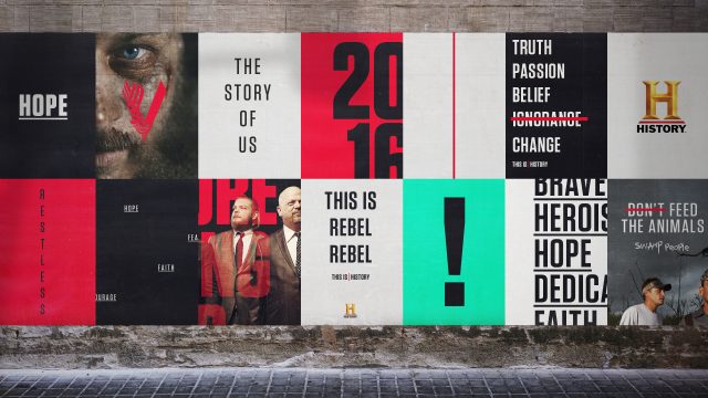
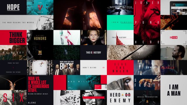
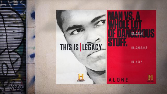
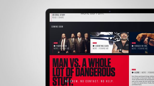
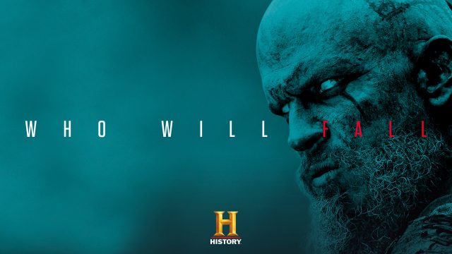
“And this is reflected in a new on-air experience with a change to way the shows are promoted – emphasizing character and story over purely high-impact promos and changing the flow of the ad-break junction to feel more engaging and immersive. This new story driven approach is reflected in print, digital and social feeds.
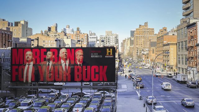
“The typeface is Tungsten and used in different weights and dynamic layouts to create a strong editorial look. In motion it comes to life through movement inspired by the cadence of the spoken word. And in print, digital and advertising to have a much more graphic and modern sensibility.
“It was important to make the H icon the hero and give it new life. We created a series of short idents that reinterpret it as a reflection of infinite stories. The facets are mirrored and therefore reflect different perspectives of the same scene – a metaphorical expression of history told from different points of view.”
Client: History Channel
Design/production: DixonBaxi