MakeMake Appoints Alex McDowell, RDI, as Director of New Narrative Design Department
July 17, 2026
LA’s Laundry say they approached the challenge of creating new IDs for The Simpsons – arguably the most graphically identifiable broadcast property of all time – with the strategy of “keeping it recognizable visually but surprising tonally.”
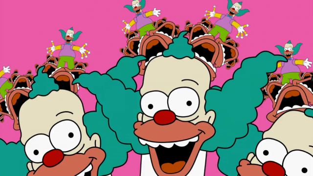
“Fans want what’s familiar but are also critical and dismissive if it doesn’t feel like there’s a twist.
“After considerable design exploration with FX, conceptually we determined that the look and feel should match the show, but approaching the illustration and animation style very abstractly and minimally with nods to characters outside of Bart, Homer, Marge and Lisa felt the most new and unique.
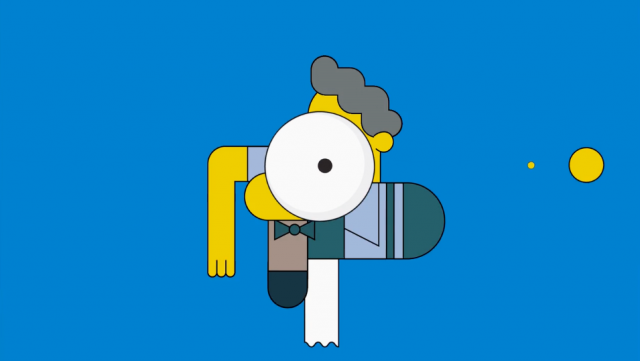
“Our gut pushed us towards really simple ideas to start, minimalist, graphic, lots of sliding, and generally pretty reduced down.
“As we progressed, we started to notice being too simple worked at times, but there were moments that adding a lot more layers also added a quirky layer that felt very Simpsons-esque.
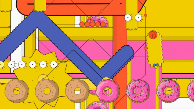
“Still very much in this world of sliding abstraction, we approached the second pass with a tidal wave of graphic elements to jolt viewers minds.
“Like with most creative processes, you have to try stuff to find stuff. Up to this point, everyone was loving where we had evolved the branding. But something was missing. We all picture The Simpsons as screams, splats, wiggles and wobbles, and it was time to marry these illustrated ID’s with their destiny.
Client: FX Network
Design, illustration, characters, 2d animation: Laundry