


Alkemy X Boosts Visual Effects Leadership Team
July 7, 2026
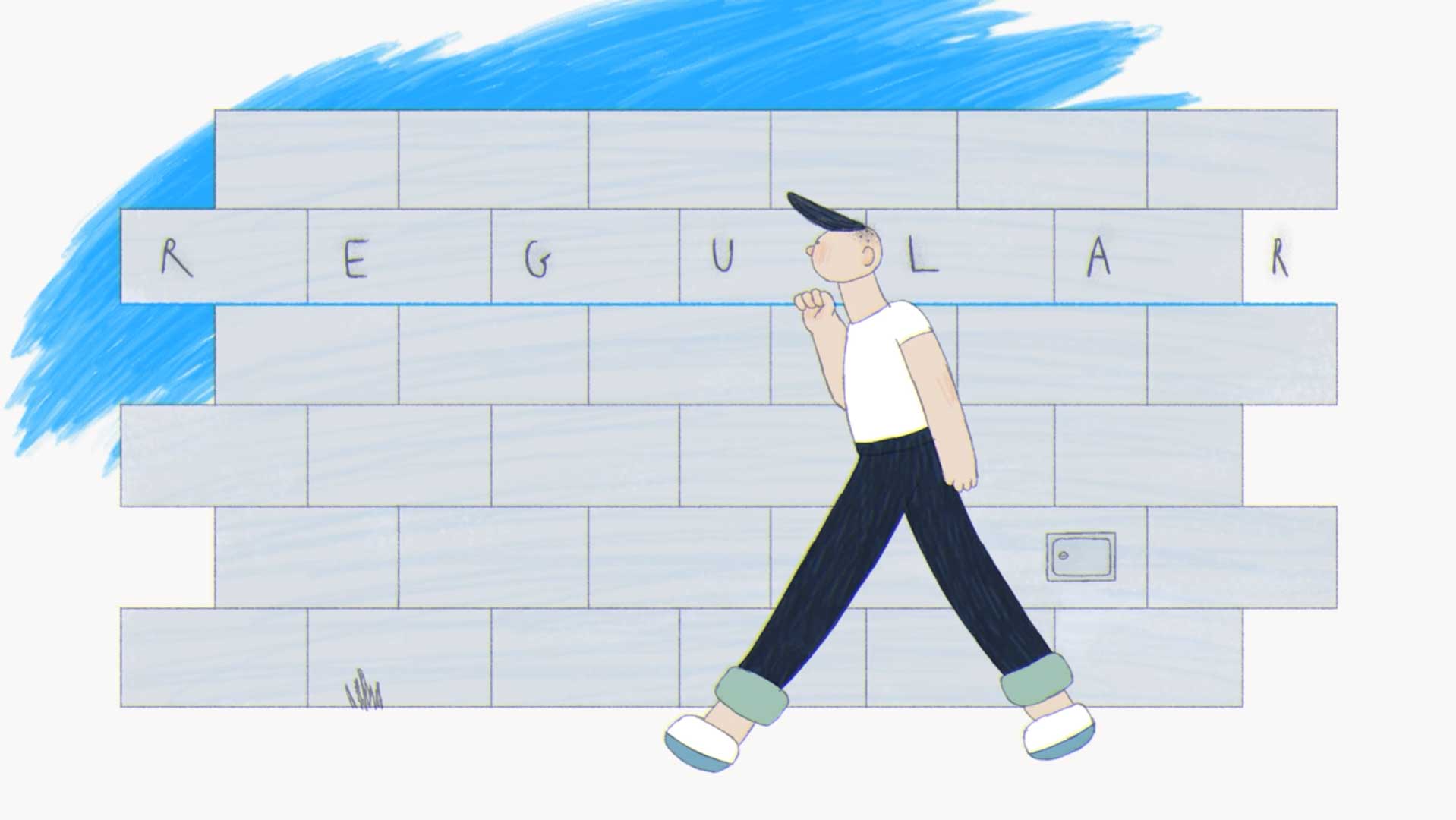
San Francisco animation artist Nata Metlukh (whose wonderfully deranged short film Pura Vida you should watch) just dropped a delightful piece of hand-animated absurdity about type called Regular.
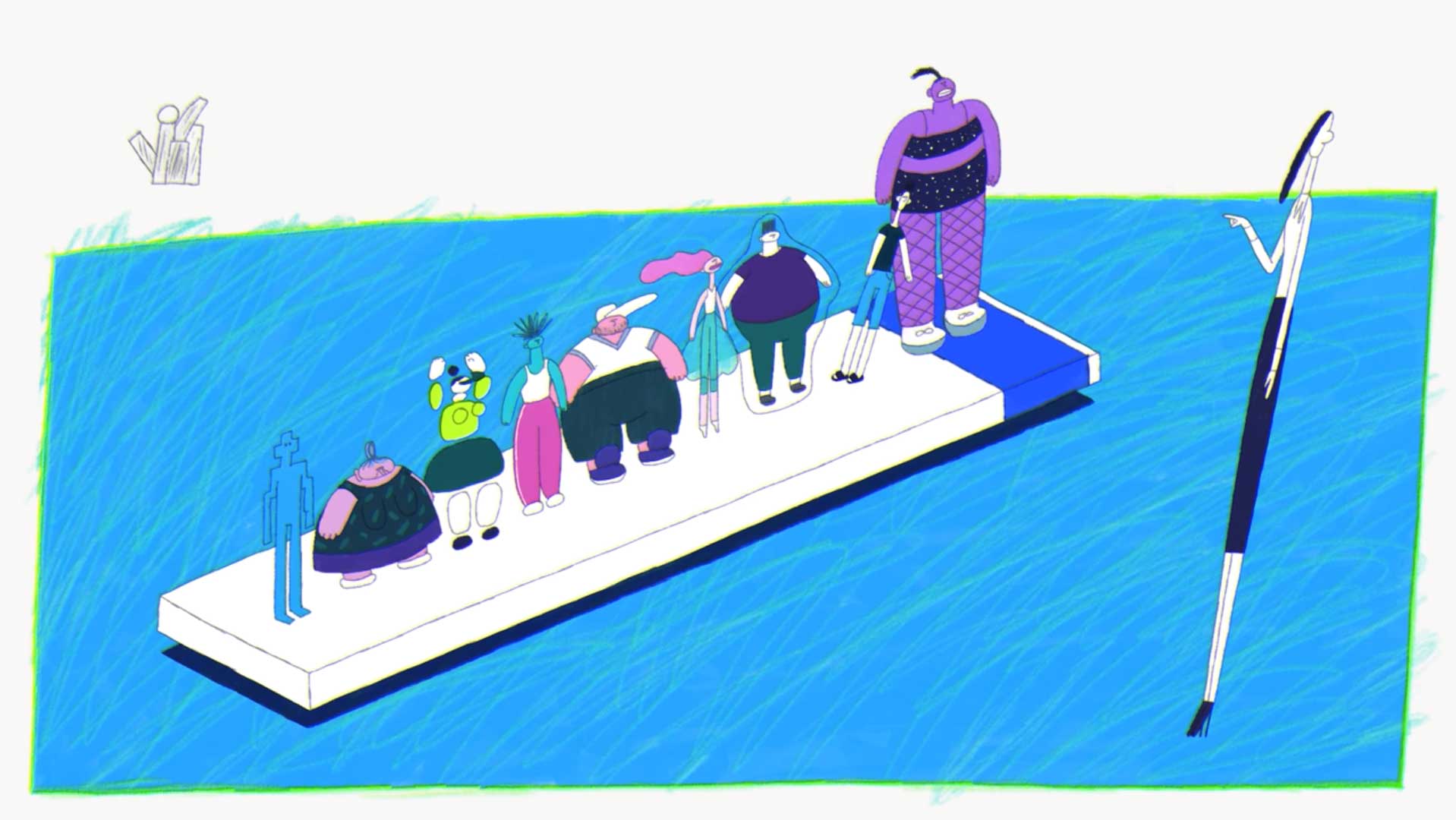
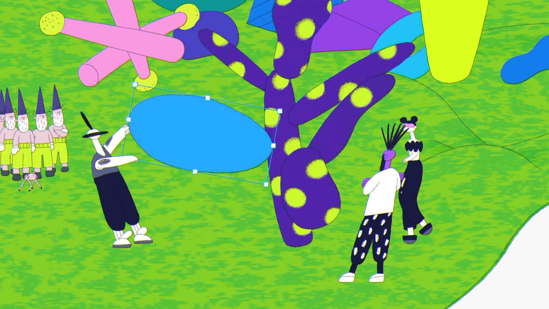
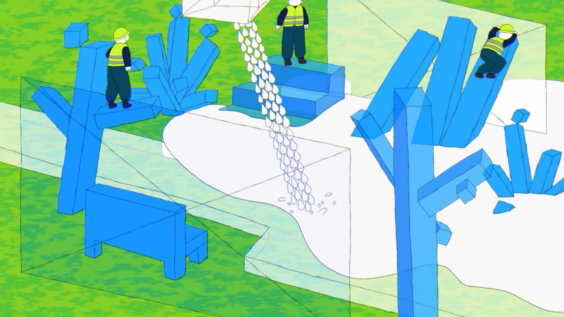
Nata Metlukh: “This is a film about fonts. There are no texts or letters though. Fonts are human characters living in a graphic design world, each of which has unique properties: Bold makes everything thicker, Italic tilts things, Monospace equalizes objects by width, etc.
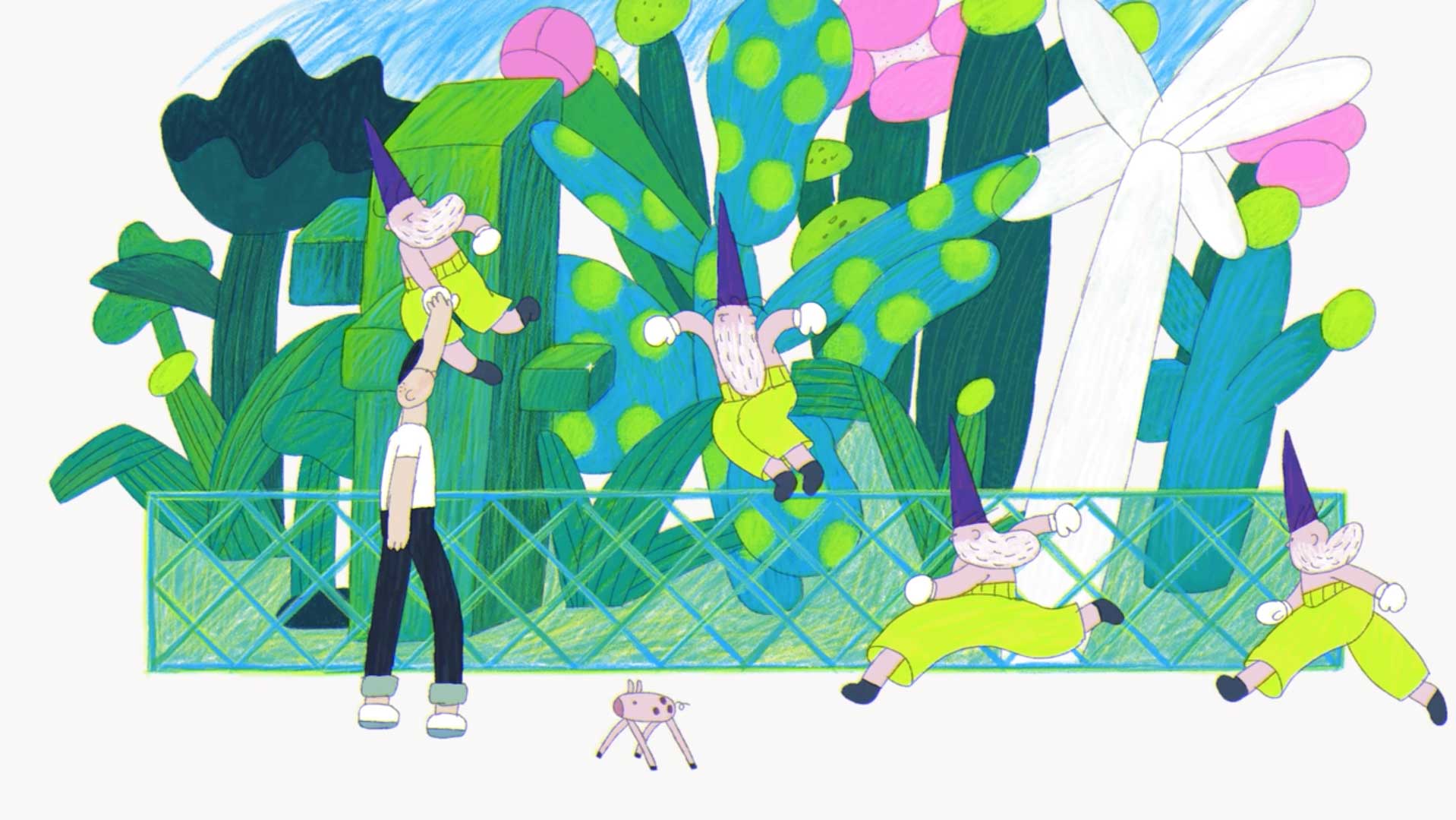
“Fonts team up to build a garden, and the five boxing wizards jump in quickly to inspect their work. A negative space storm flushes everything away, but Regular comes and fixes the garden.
“The boxing wizards play an important role. ‘The five boxing wizards jump quickly’ is a pangram, i.e. a sentence using all the letters of the alphabet. Pangrams are used by graphic designers to preview and check fonts. In the film, the wizards are inspectors who determine whether the fonts’ work is good or not.”
Director/animator: Nata Metlukh
AE coding: Gennadiy Chuyeshov
Sound design: Daruma Audio