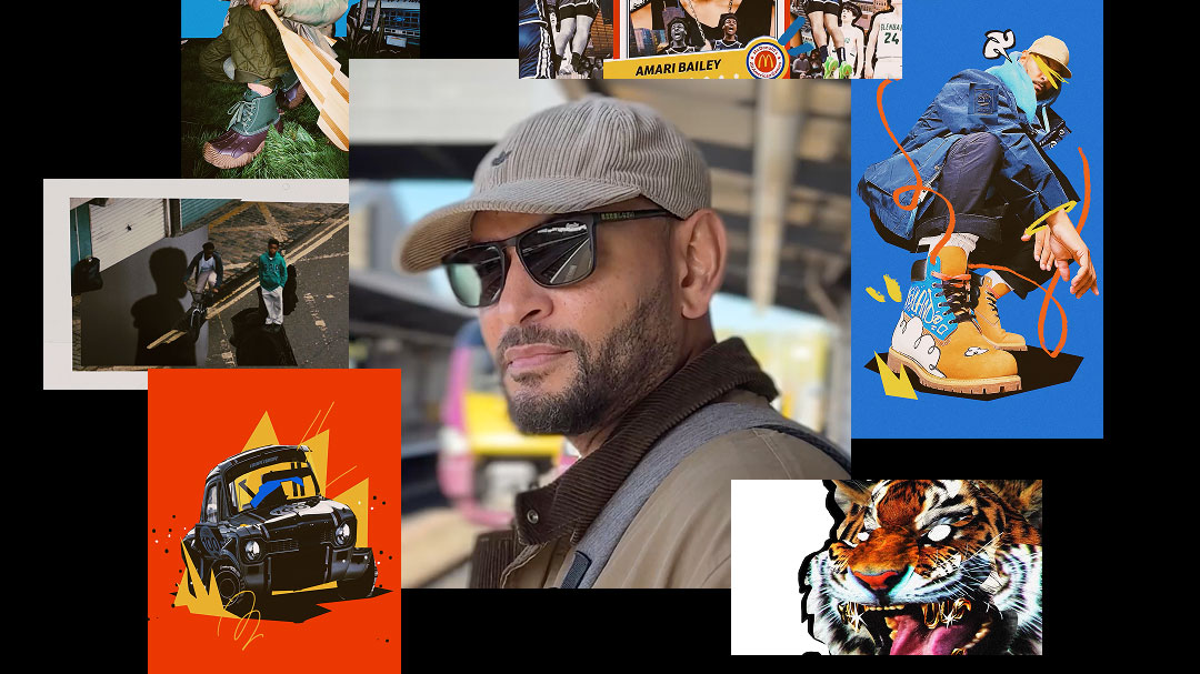


Hornet Signs UK Director Troy Browne to Global Roster
October 28, 2026
Chilean broadcaster Mega and their family of channels and platforms get an infusion of vibrant, stylish fun in this redesign of their on-air graphics and brand system by the CG motion crew at Lumbre in Buenos Aires.
Sergio Saleh, founder/CD at Lumbre: Mega had been speaking to its audience in the same way for more than five years. It was part of the landscape, and that made it easy to overlook.
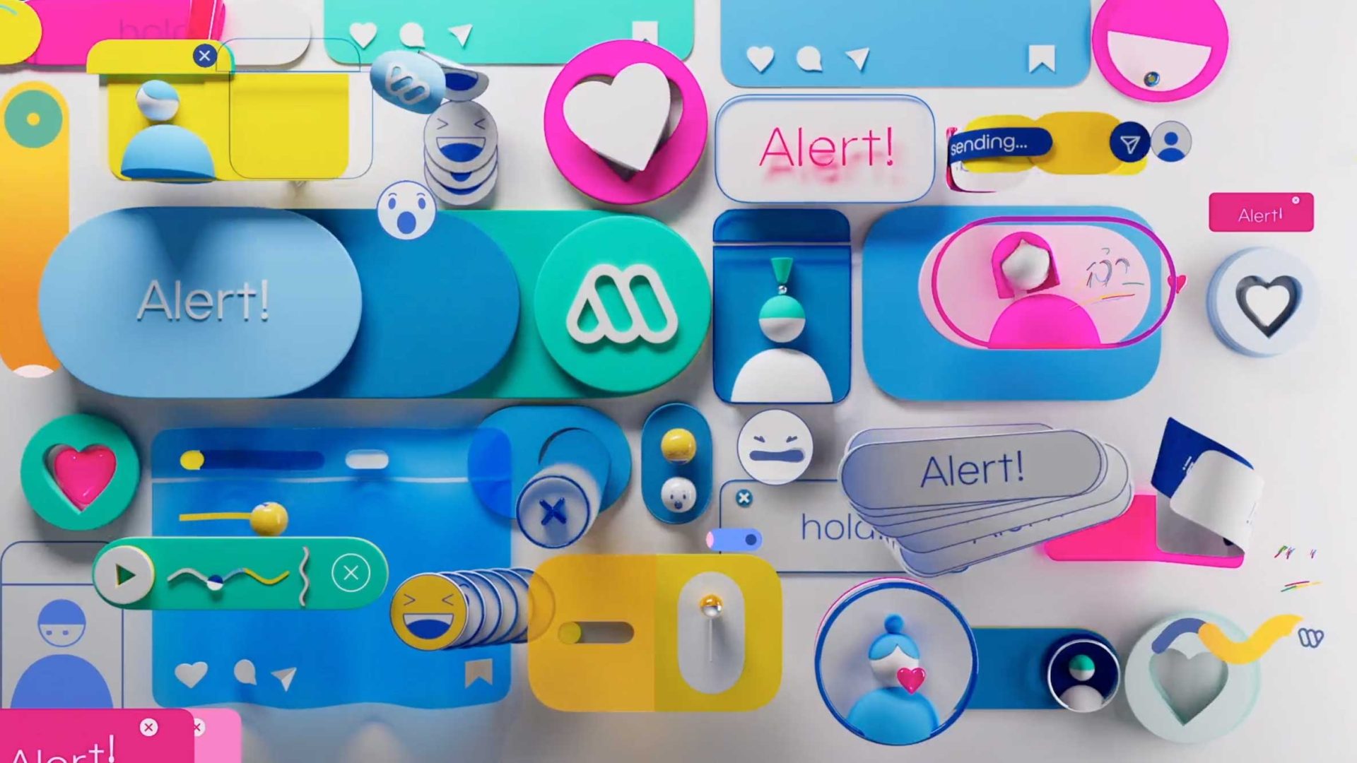
At the same time, the brand spans Mega, Mega 2, Mega Ficción, Mega Plus, the Mega GO app, mega.cl and social accounts. Viewers move between screens all day, and the network wanted a fresh, modern way to talk to them, with one clear look that unifies every platform.
“Viewers move between screens all day, and the network wanted a fresh, modern way to talk to them, with one clear look that unifies every platform.”
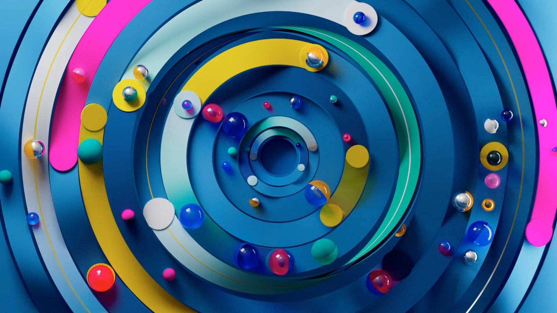
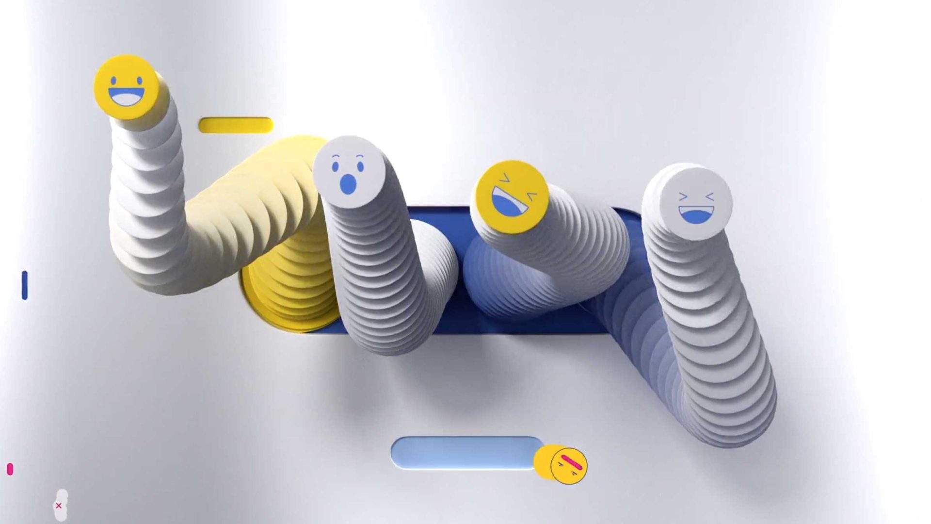
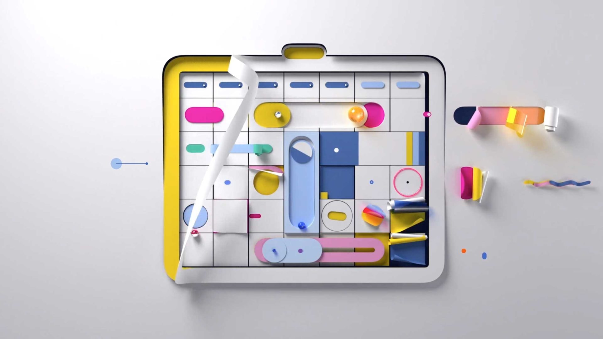
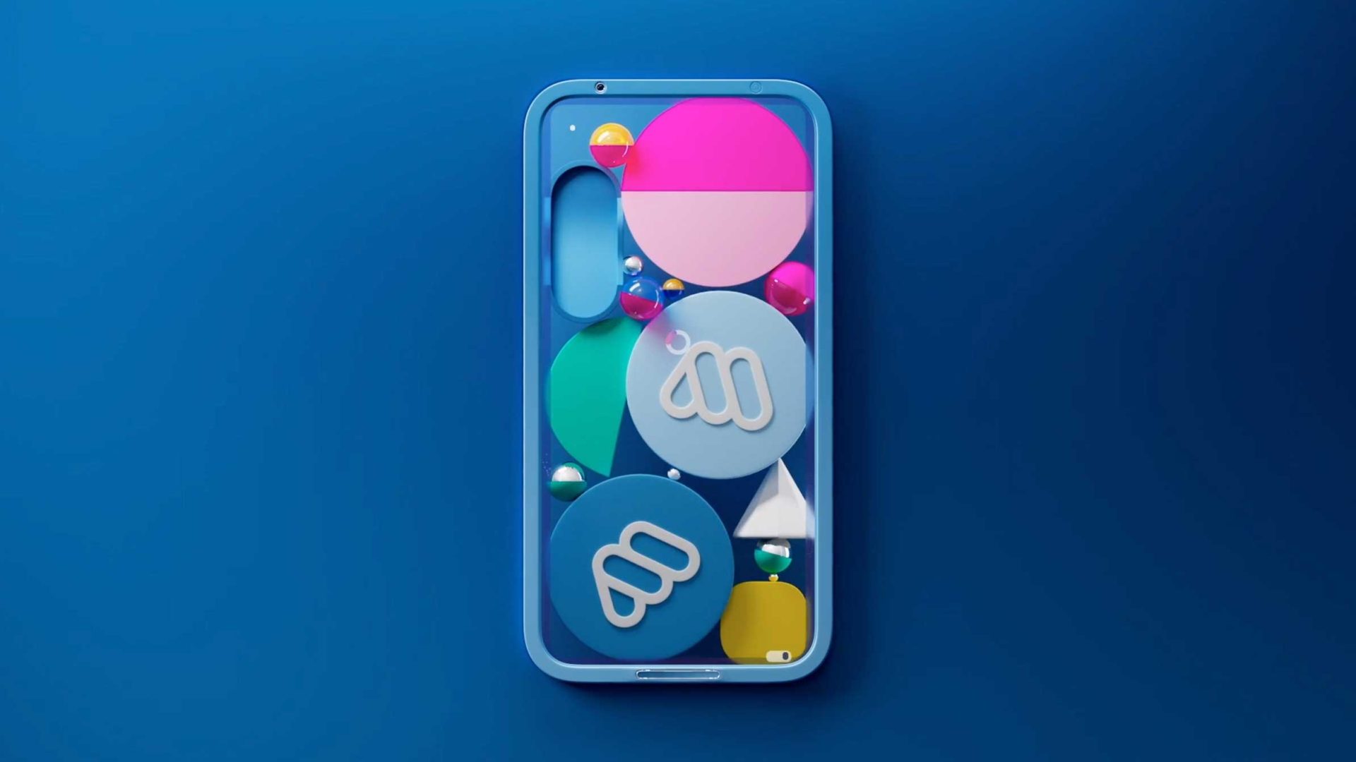
Mega’s logo is built from simple geometric modules, so we used it as the starting point for the whole system. We broke it down into its basic shapes (pills, arches, circles and half-circles) and rebuilt them into a flexible visual language. Because they come from the logo itself, everything feels unmistakably Mega.
A bold, optimistic palette of electric blues, hot pink, warm yellow and bright cyan, anchored by black and neutral grays, express a positive mood and give each program its own color moment.
We delivered a new on-air graphics system, 2D and 3D information graphics, bumpers, promo closers and logo IDs, color palette and typography, motion language and animation tests, plus application examples across promos, series, news, and digital.
Client: Mega Chile
Production: Lumbre
CD: Sergio Saleh
EP: Pablo Encabo
Art Director: Adriana Campos
Animation Director: Jose Cambariere
Animator: Ignacio Farias Sunier
Account Manager: Jeff Keisel