

MAKE Animation Thesis Grant Announces 2026 Winners
June 23, 2026
Studio longevity in the motion design world is all too rare, so it’s a pleasure to see yU+co, founded in LA by Garson Yu in 1998, still operating at the top of their game with these titles for the Netflix action-thriller series Man on Fire.
Garson Yu: “We had the pleasure of collaborating with writer/producer Kyle Killen to create this sequence. The show follows former Special Forces veteran Creasy as he fights to keep Poe, a teenage girl, safe from forces much greater than him, while also trying to get his life back on track.
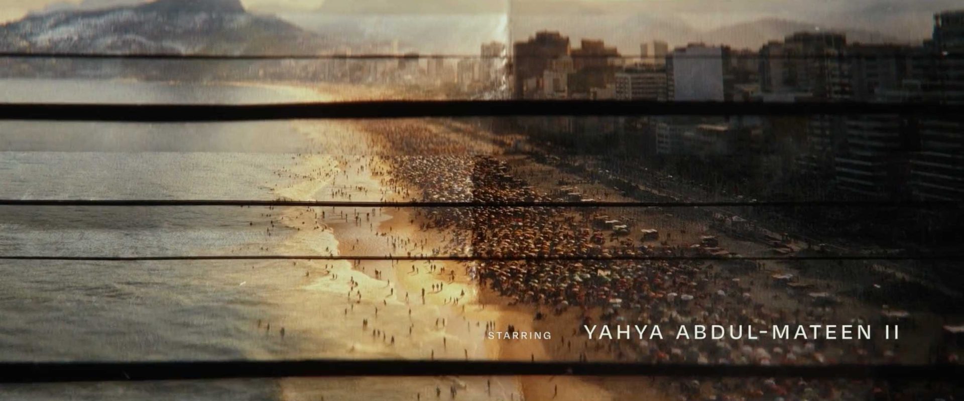
“The titles weave together vivid scenes of Rio de Janeiro, Creasy’s haunted past, and imagery from the show.”
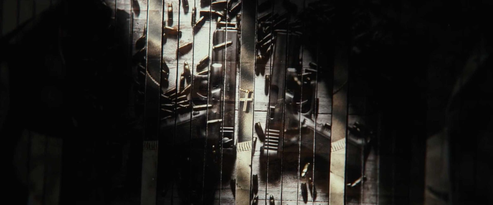
“Inspired both by Creasy’s fractured life and the government conspiracies that drive the show, we used shredding paper as the vehicle for the sequence. The titles weave together vivid scenes of Rio de Janeiro, Creasy’s haunted past, and imagery from the show.
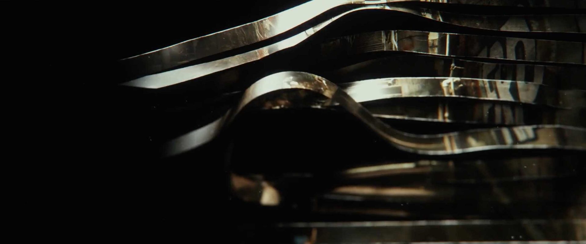
“The sequence begins with grounded realism, juxtaposing the beauty and grandeur of Rio de Janeiro with the chaos and danger of the favelas. Soon, the shredded paper fragments take on surreal, choreographed movements as we transition from one image to the next, like memories unspooling.
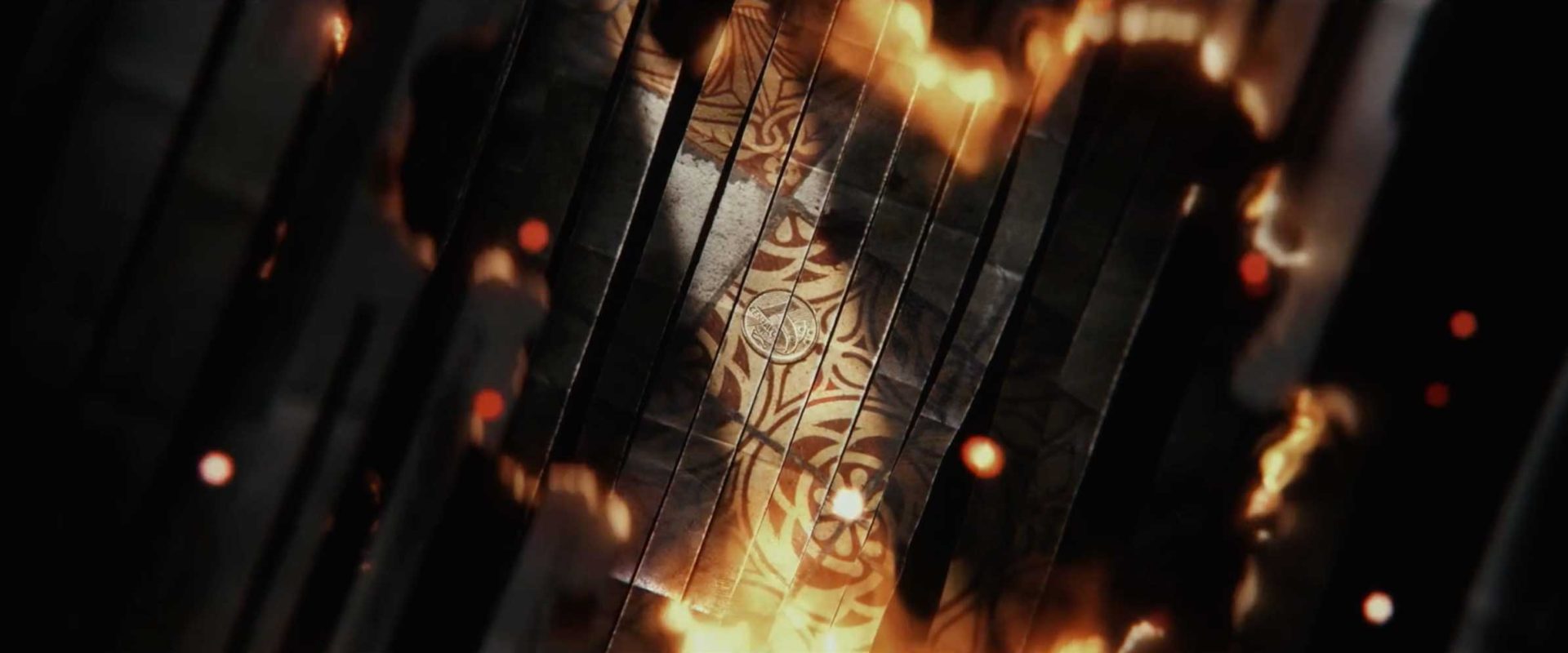
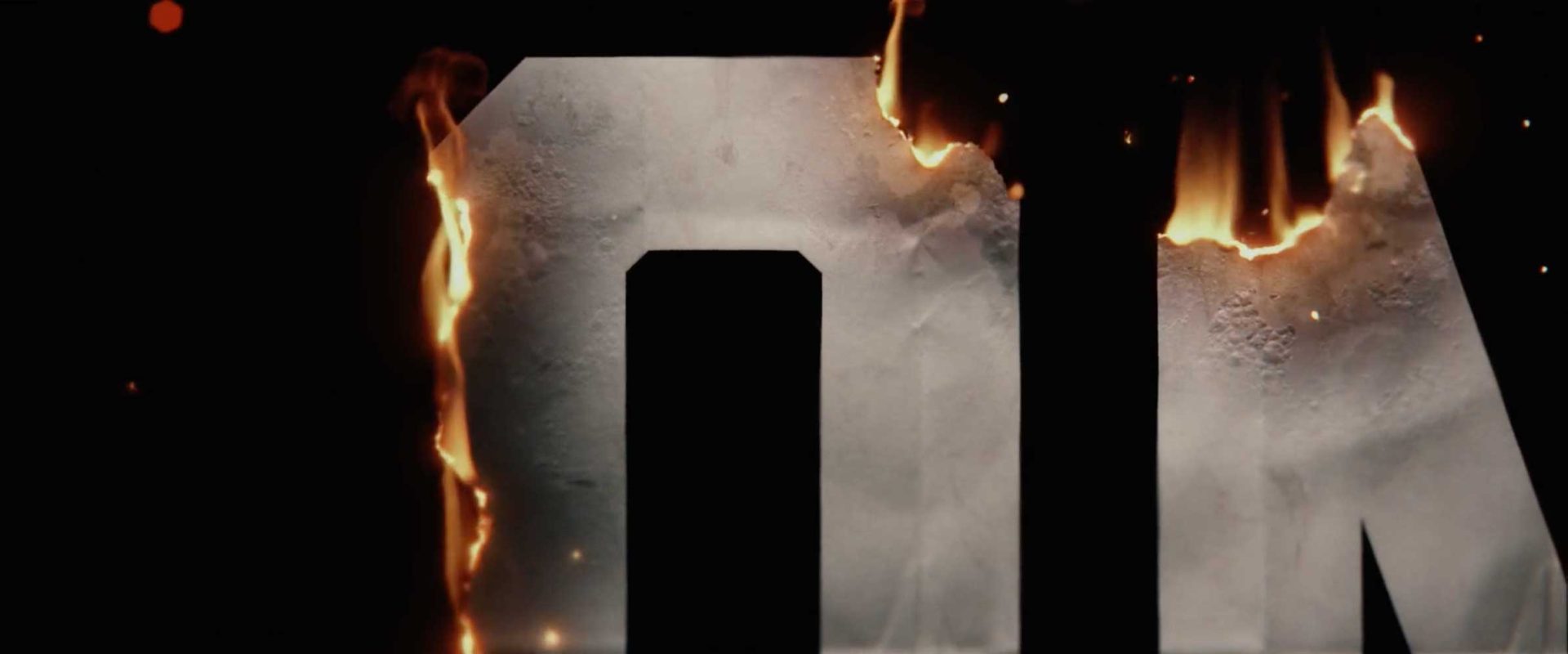
“As we drift deeper into this cascade, embers begin to pierce the paper and everything is caught in the crossfire. In the end, we’re left with a single, hopeful image – Poe and Creasy. Their relationship is the heart of the show, and we wanted to further establish this as we reveal the main title.”
Client: Netflix
Production: yU+co