

Not To Scale Signs NERDO for Representation
May 7, 2026
With so many screens vying for viewers attention, the creative task of packaging big-budget television and streaming programming has never been more important or come with so much pressure to make a dent in popular culture.
The variety of tones and techniques on display in these eight projects (from the quiet elegance of the Queen Charlotte: A Bridgerton Story titles by Studio AKA to the rampaging light show of Elastic’s Monday Night Football package), prove that directors and designers not only rose to the occasion but seized the opportunity with a certain fearless passion.
All films were published in The Stash Permanent Collection during 2023 and are listed here in chronological order by their issue of publication.
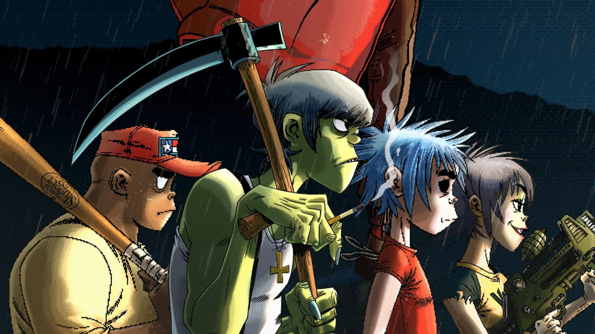
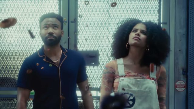
“WEDNESDAY” TITLES (Above)
Issue: Stash 157
Aaron Becker, CD at Filmograph in Los Angeles: “The idea for this title sequence was to expand on the world of Wednesday Addams without purely mimicking the aesthetic and locations of the show – create a narrative that abandons literal logic.
“We also needed to familiarize ourselves with Tim Burton’s past work – title sequences included – without looking to repeat history, so to speak. As a director, Mr. Burton’s look is well known, but crafting a main title sequence that broadly served eight episodes of his first foray into television, as opposed to a single film, was one of the biggest challenges.”
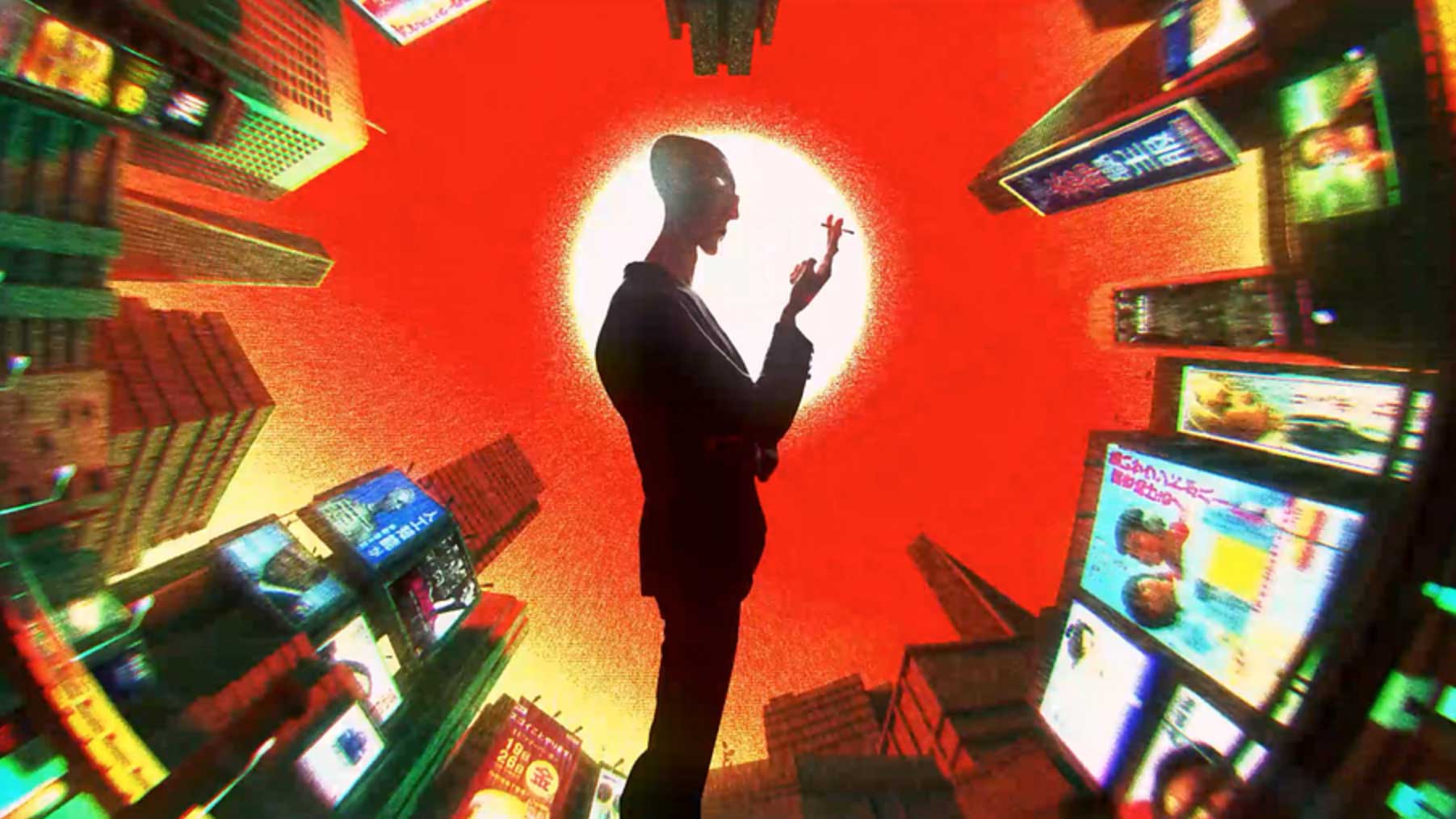
“HELLO TOMORROW!” TITLES
Issue: Stash 158
How do you open a retro-future TV series about a scam selling timeshares on the moon? CD Ronnie Koff and Imaginary Forces opted for what they describe as a “hypnotic ride of apparatuses with an underlying eerie imbalance.”
From Imaginary Forces: “In partnership with Apple TV+ we showcased the illusions of the past and created a timeline of invention, showcasing the ultimate American escape in what feels like a showroom of robots, gizmos, and doodads – teetering on the edge of a slightly different evolution in technology than our world today.”
XFL ON ESPN
Issue: Stash 159
Barton Damer, owner/CD at Already Been Chewed in Wylie, Texas: “ESPN approached us to help rebrand their coverage of the XFL, a professional American football league. The process involved exploring different looks and animation techniques that could be applied to a wide range of deliverables including show openers, wipes, lower thirds, and a 60-second brand film.
“One of the challenges of working on sports graphics is there’s a box that most sports graphics typically stay inside of. ESPN was determined to think outside of that box and we utilized heavy simulations and 3D animation in Houdini and Cinema 4D to create a graphics package that would capture the excitement and energy of the XFL.
ESPN NBA FINALS GRAPHICS PACKAGE
Issue: Stash 160
Director Mark Lindner at Panoply in London: “The brief was to create a new look to the NBA Finals show package that would take place on ESPN and YouTube. At the core of our mission was the development of a distinct visual language that could resonate with the energy and fervor of the NBA Finals.
For this, we introduced ‘Shimmer’, an evolving golden simulation technique that acted as the backbone of our creative exploration. Whether morphing into the iconic NBA trophy or seamlessly transforming into individual team logos, ‘Shimmer’ demonstrated an exceptional blend of versatility and spectacle.”
“QUEEN CHARLOTTE: A BRIDGERTON STORY” TITLES
Issue: Stash 161
Manddy Wyckens, animation director at Studio AKA in London: “The client was very open-minded and I decided to respond to their brief with a strong, uncompromising take depicting what I thought would work the best rather than trying to anticipate what the client might initially have in mind.
“Thankfully they liked the initial proposition. I think it was about understanding their script, ambition and the emotional tone they were trying to set through the TV show and responding to the brief in the same tonality and cinematographic language as them.”
“ESPN “MONDAY NIGHT FOOTBALL 2023”
Issue: Stash 162
Paul Mitchell, CD at Elastic in Santa Monica, CA: “Monday Night Football is one of the longest-running and highest-rated primetime series in history, and that was incredibly important to the ESPN creative team. They wanted to bring back the primetime lights and shift the focus to real players by finding ways to use still photography and footage in a dynamic way.
“This was further defined by thinking about who the players and team match-ups would be each week. Another part of the brief was the MNF logo shield which was being refreshed as well. A marquee ticket shape was incorporated into the shield as an additional branding element. We set about defining the visual language around all of these key components.”
“LESSONS IN CHEMISTRY” TITLES
Issue: Stash 162
Hazel Baird, CD at Elastic in Los Angeles: “The client wanted something bright and whimsical which included food and chemistry, and the titles needed to work regardless of the mood of the preceding scene. Color was a big talking point as they wanted pastel colors to reflect the time period. Even though the series deals with trauma, sexual assault, and sexism they didn’t want a heavy serious title.
“Since the titles needed to work after the cold open. The first few seconds have an ambiguous tone and from then on the sequence travels through various moods while always trying to retain an element of fun. We knew the music from the start which was a massive help and inspiration. The brilliant ‘Wham (Rebop Boom Bam)’ by Mildred Bailey has such a great attitude we thought it was perfect for a song and dance number conveying joy, anger, and frustration.”
“BODIES” TITLES
Issue: Stash 162
Marcus Armitage, director at Studio AKA in London: “Our brief for the Netflix limited series ‘BODIES’ was to craft an engaging opening title sequence that would resonate with the core themes of the show. It needed to span multiple time periods and seamlessly integrate the four central police investigations.
“Designing a title sequence is an intricate dance, offering glimpses of the show without giving away too much. It’s about setting the tone for the viewer’s next hour. We aimed for a balance between intrigue and simplicity, creating a clean and graphic style. The main challenge was maintaining an exceptionally high level of detail throughout, and with such a minimalist look, there was no room for error.”
Watch all the Best of Stash 2023 Collections.