After 10 years of working their way onto the top tier of the 3D motion food chain, the team at Tendril rethinks the studio’s branding and find themselves moving forward with a smart and tasteful design evolution.
Tendril co-founders Chris Bahry and Alexandre Torres: “The refresh project began as a small update to welcome a new decade with a new perspective, reflecting how our studio had come to evolve and mature throughout the years.
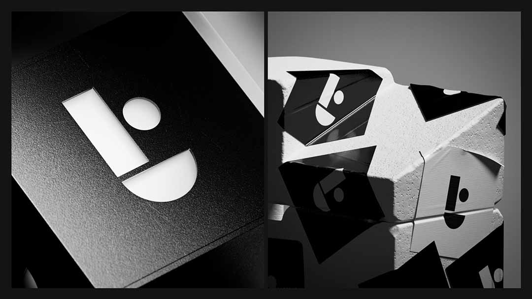
“We decided to revisit our branding with the help of our friends at Toronto studio Worship. After a few design proposals, we ultimately came back to an ‘if it isn’t broken’ kind of decision – realizing the logo, our most recognizable brand element, didn’t need to go away but rather evolve into what we now call the T-dot.
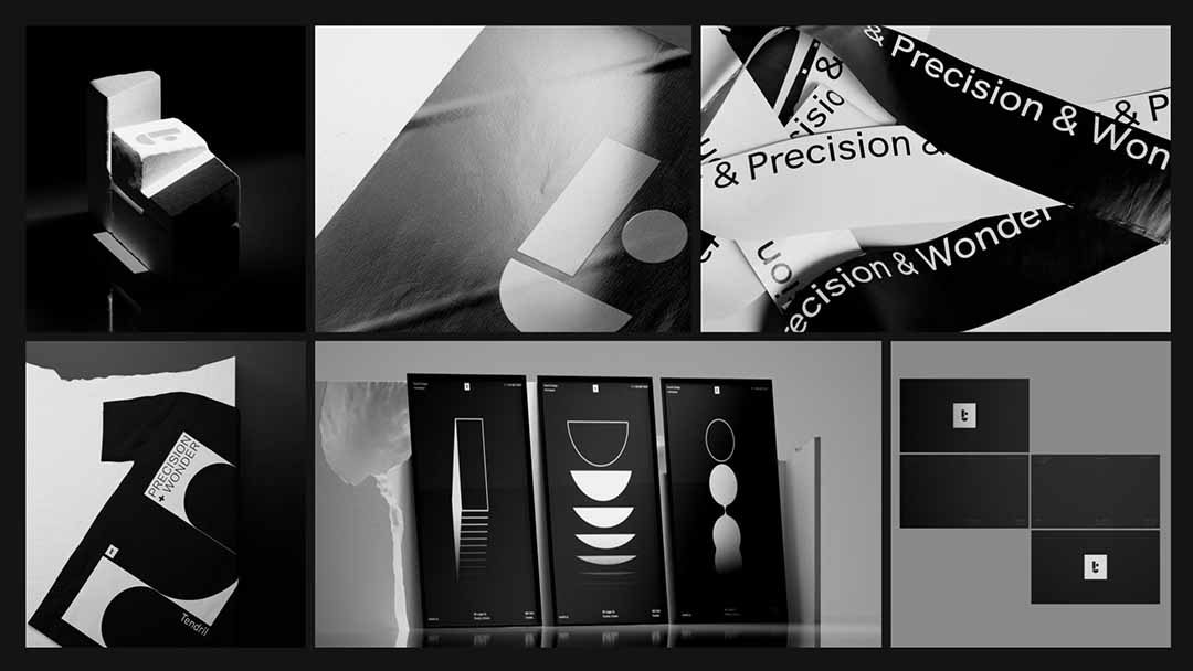
“Worship also came up with the idea of a flexible system that could be quiet and conservative or bold and expressive, depending on context and communication needs.
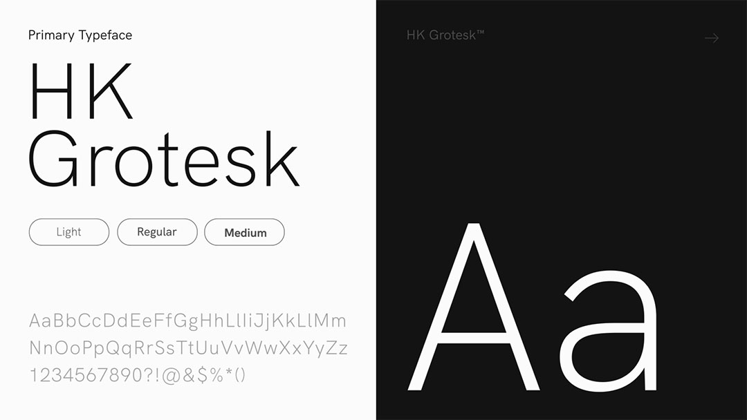
“Our team then began to establish the key building blocks for the brand, including positioning, typography, color, 3D brand imagery, icons, and motion.
“We gradually distilled our compositions down to their most essential elements. The result was a series of images that were not only visually striking but also conveyed a deeper meaning and communicative purpose.”
“We love using color, but how do we create a palette for a brand with work that has so much color? In the end, we decided to create a black-and-white palette with tones of gray. This allows the brand to take a step back and let the work speak for itself.
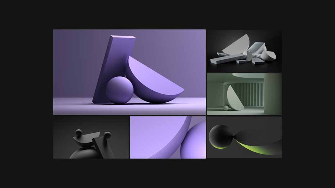
“Fueled by the initial inspiration from Worship, we delved deep into the possibilities of using the three shapes that make up the T-Dot to develop a library of brand imagery, experimenting with different environments, compositions, and colors.
“We gradually distilled our compositions down to their most essential elements. The result was a series of images that were not only visually striking but also conveyed a deeper meaning and communicative purpose. Through this exploration, we established our design principles: no more than three shapes, tone on tone, simple visual metaphors, a focus on light and shadow, and a less is more philosophy.
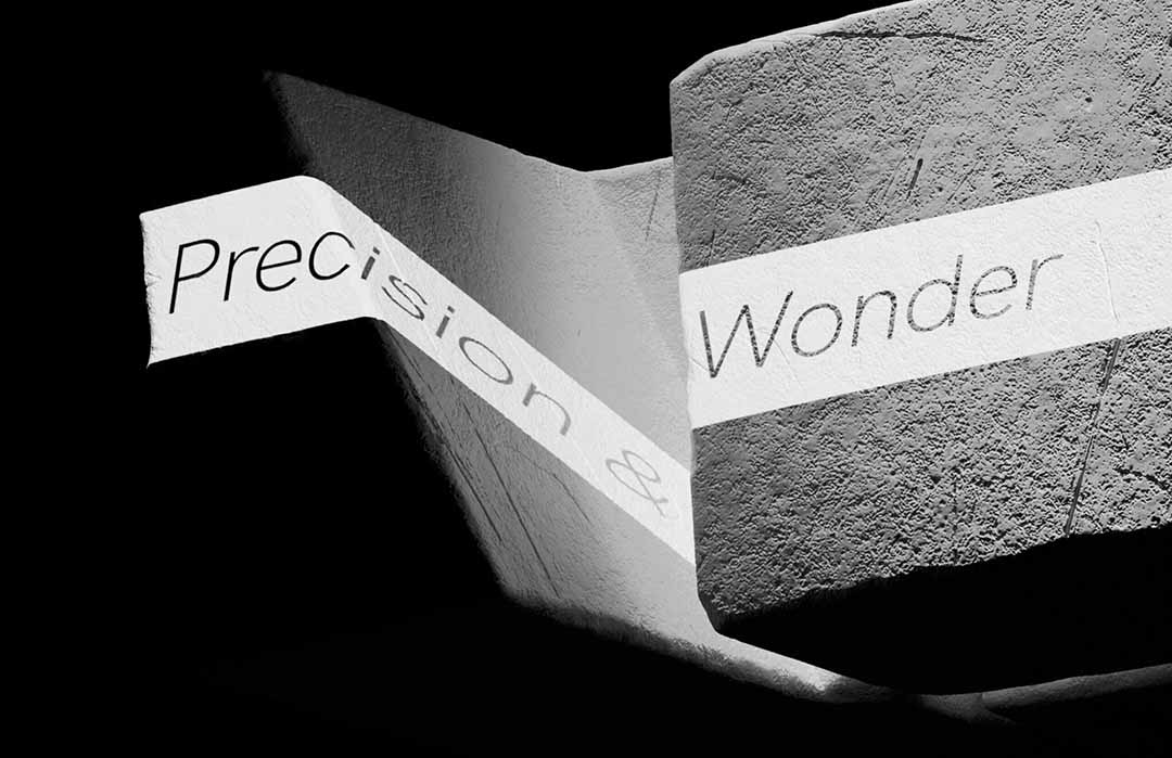
“As a design animation studio, it was natural to explore the possibilities of incorporating motion into our brand identity. To achieve this, we established a set of motion principles aligned with the design principles of the brand: Elegant & premium, Minimal & simple, Light & dark, Coarse & smooth, Balance & skew, and Precision & Wonder.
“These principles were a guiding light for every shot and every moment, ensuring consistency and cohesiveness throughout the project, creating a simple yet transformative story that introduced the 3D brand.”
Production: Tendril
Creative Director: Chris Bahry, Alexandre Torres
Brand Refresh Design: Worship, Rafa Cezar
Executive Producer: Ramona Gornik-Lee
Producer: Niko Hook
Guidelines and Toolkit: Rafa Cezar
Communications/PR Manager: Jill Wilkie
Content Strategy and Copywriting: Sierra Joseph
3D Assets Design: Rafa Cezar, Joseph Recoskie, Aiden Riekenbrauck, Rita Louro, Shannon Hoyne, Marcelo Souza
2D Animation: Rafa Cezar
3D Animation: Joseph Recoskie, Samuel Bohn
Light/Render: Brad Husband, Joseph Recoskie, Aiden Riekenbrauck, Marcelo Souza
Comp: Brad Husband, Astrid Cardenas
ID Animation Design/Animation: Joseph Recoskie, Samuel Bohn, Nidia Dias
Light/Render: Brad Husband, Joseph Recoskie, Aiden Riekenbrauck, Nemanja Ivanovic
Audio: Cypher
