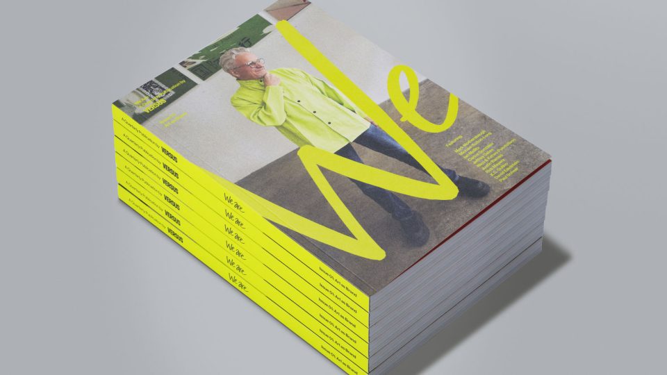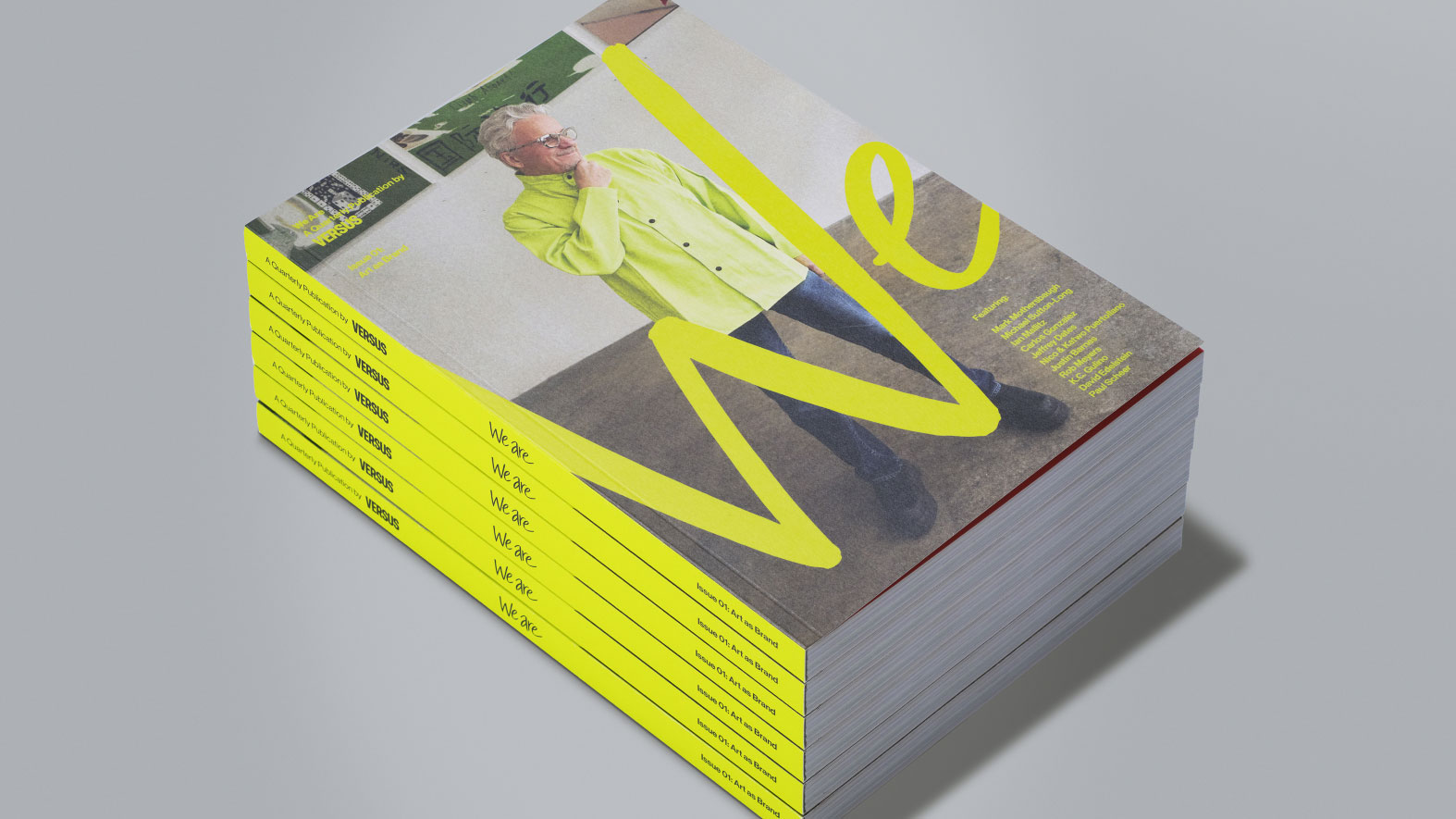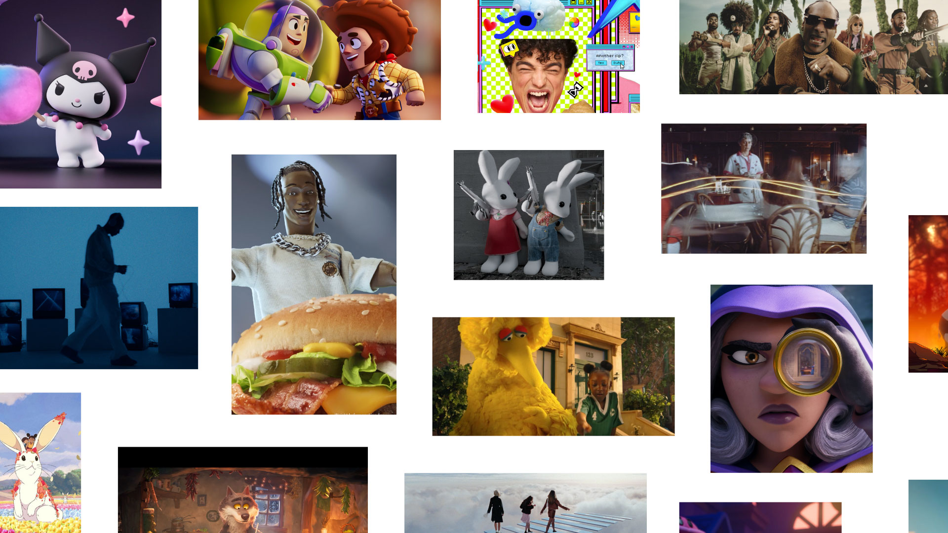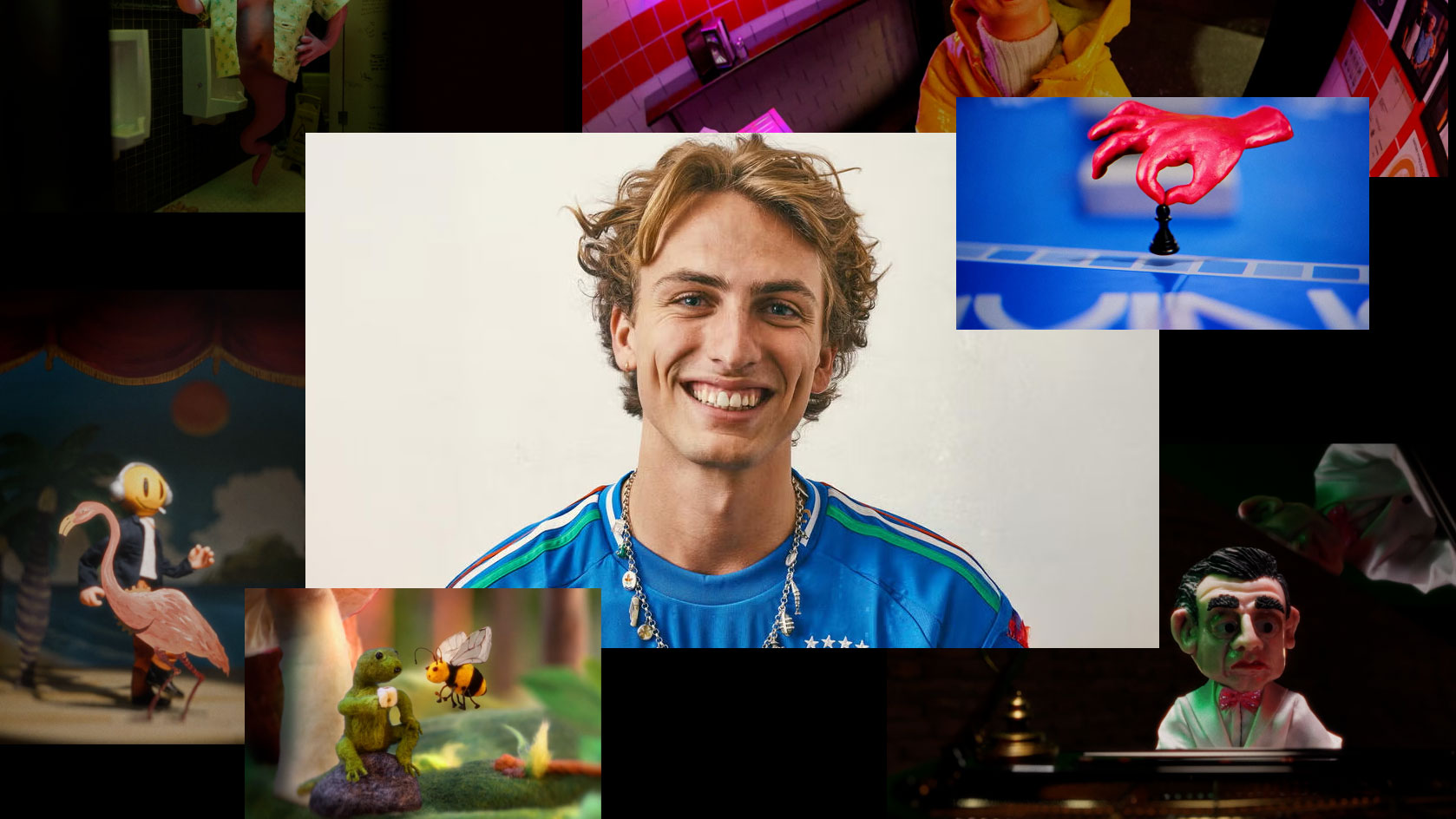
A stack of identical WE ARE print magazines featuring a photograph of a man in a lime green jacket on the cover. Frame from Stash Magazine article.

Versus Launches New Quarterly Print Magazine “WE ARE”

From the release: In a world of endless content, instant gratification and AI-generated everything, creative studio Versus is making a case for slowing down. Introducing WE ARE, a new 170-page quarterly print publication celebrating creativity, craft and culture through the perspectives of the people shaping them. [Watch]
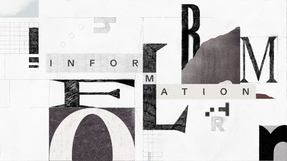
A collage of fragmented letters and grid patterns, designed for the Harvey II Brand Manifesto, arranged to spell the word INFORMATION. Frame from Stash Magazine article.

Oddfellows Warm Up Harvey II Launch With Pencil & Paper

It’s hard to think of a business category more detached than legal AI but this textured and tactile treatment from the design crew at Oddfellows in Portland for the launch Harvey II layers humanity onto the legal intelligence. [Watch]
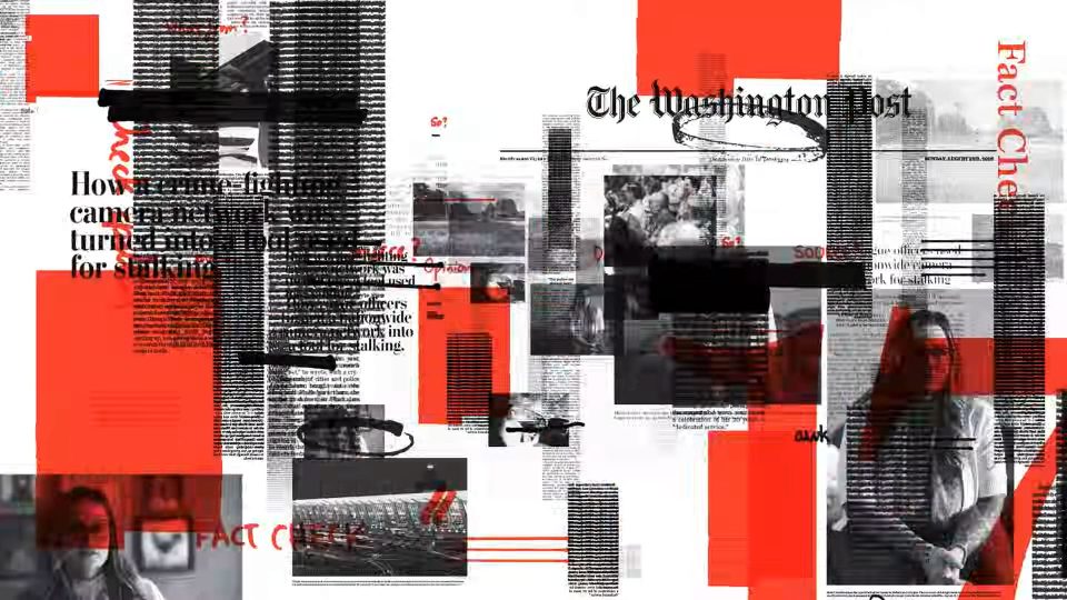
A Washington Post page about a camera network used for stalking, presented as a Relentless campaign film by Blinkink and Uncommon, heavily obscured by red geometric shapes, black redaction bars, and hand-written annotations. Frame from Stash Magazine article.

Sabih Mahmood’s Relentless Motion for The Washington Post

Working thru Blinkink, director Sabih Mahmood builds up layers of gritty urgency to match a compelling script by the NY office of Uncommon Creative Studio in their first work for the Washington Post. [Watch]

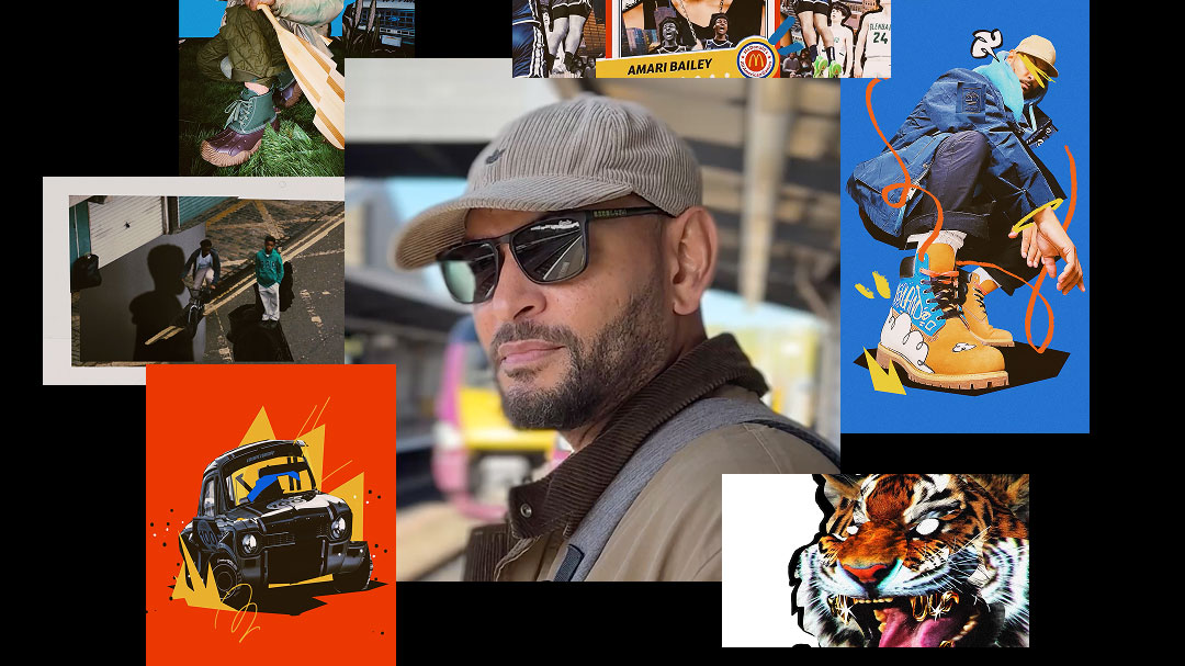
A collage of four contemporary art images, including abstract drawings reminiscent of David Carson’s dynamic style, a crowd viewing a poster for LOLA as part of a brand refresh, and a black-and-white photo of a person standing in a doorway. Frame from Stash Magazine article.

David Carson & DxD Launch LOLA’s Crazy Ambitious Rebrand

To mark the leap from Madrid-based agency to micro network (with offices in São Paulo, NYC, and LA), Omnicom’s LOLA enlists the one and only David Carson to add his signature graphic deconstruction to their rebrand. [Watch]

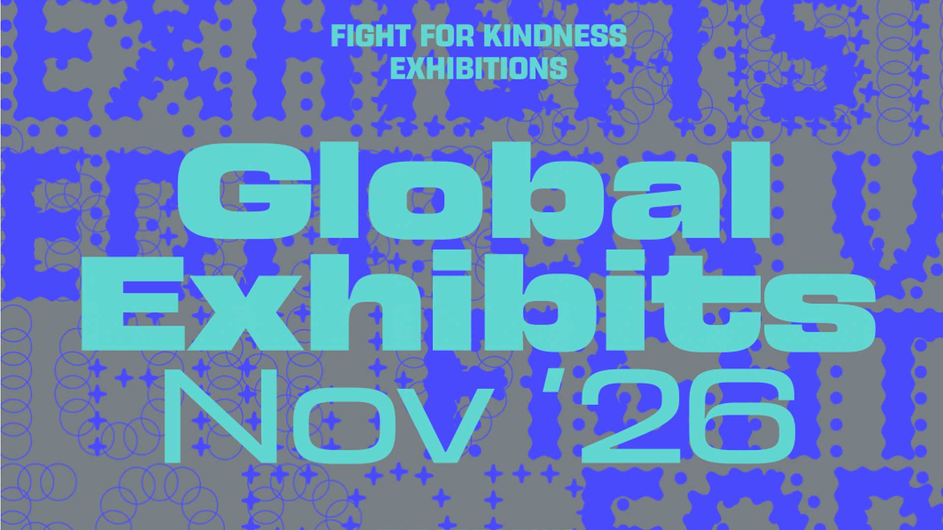
A bright pink and blue poster reads Fight for Kindness Poster Gallery 2026 by Zetafonts Edition VI Fight For Kindness, with repeated background text Fight For Kindness in bold, pixelated letters. Frame from Stash Magazine article.

Fight for Kindness Poster Gallery Edition V Now Live

Born from the belief that typography can be more than a tool for communication, Fight for Kindness 2026 celebrates the transformative power of letters to inspire connection, empathy, and social awareness. [Watch]

A collage of four images: top left, the word “craft” in green script on a gray background; top right, a brown dachshund on a green background; bottom left, a colorful abstract figure walking; bottom right, a brand film layout by ManvsMachine. Frame from Stash Magazine article.

Zero Bucks Given: ManvsMachine Keeps it Kinetic for Canva

Somehow we missed this work by the team at ManvsMachine for Canva when it first released so we’re making up for it now. It’s a smooth blast of motion, typography, and product demo all rolled into one satisfying brand film. [Watch]