Alkemy X Boosts Visual Effects Leadership Team
July 7, 2026
The creative team responsible for the brilliant “We’re the Superhumans” Paralympics spot (Blink director Dougal Wilson, MPC, and 4creative) are back with a set of standout IDs for Channel 4. [Watch]
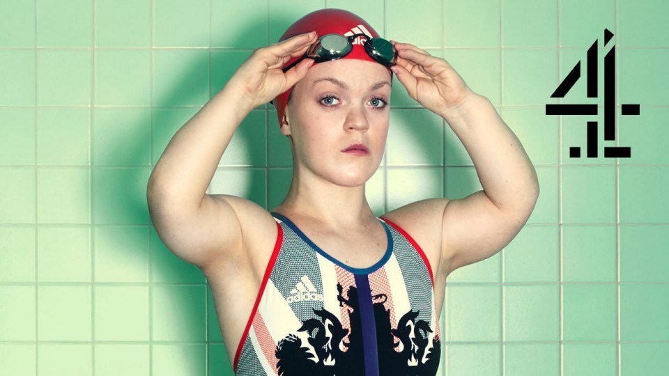
Blink director Dougal Wilson crafts a potentially disastrous brief into an uplifting and emotional joy with his fearless musical treatment of Channel 4’s campaign for the 2016 Rio Paralympics with MPC providing VFX across 144 shots, including extensive crowd replication and creation of the new Rio stadium in CG. [Watch]
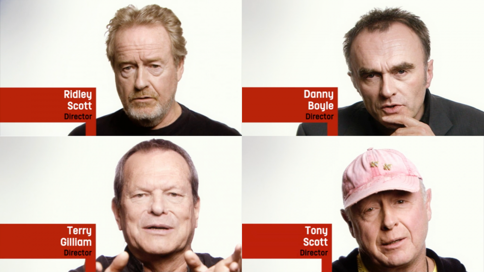
4creative, the in-house creative agency for all Channel 4’s brands, just posted a series of riveting and insightful compilations from the broadcaster’s excellent Self Portraits series featuring interviews with top directors and actors revealing their influences and favorite filmmaking moments. [Watch]

London design and motion studio weareseventeen recently won a competitive pitch to develop and produce the on-screen identity for the launch of All 4; Channel 4’s new destination for all their linear and on-demand content including this series of eclectic and fun animated pre-rolls created in concert with 4creative. [Watch]
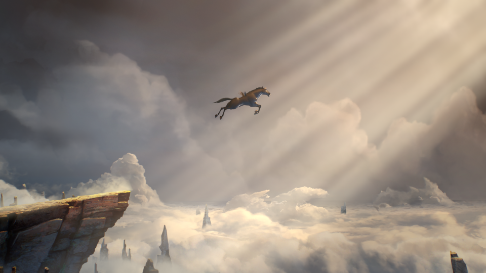
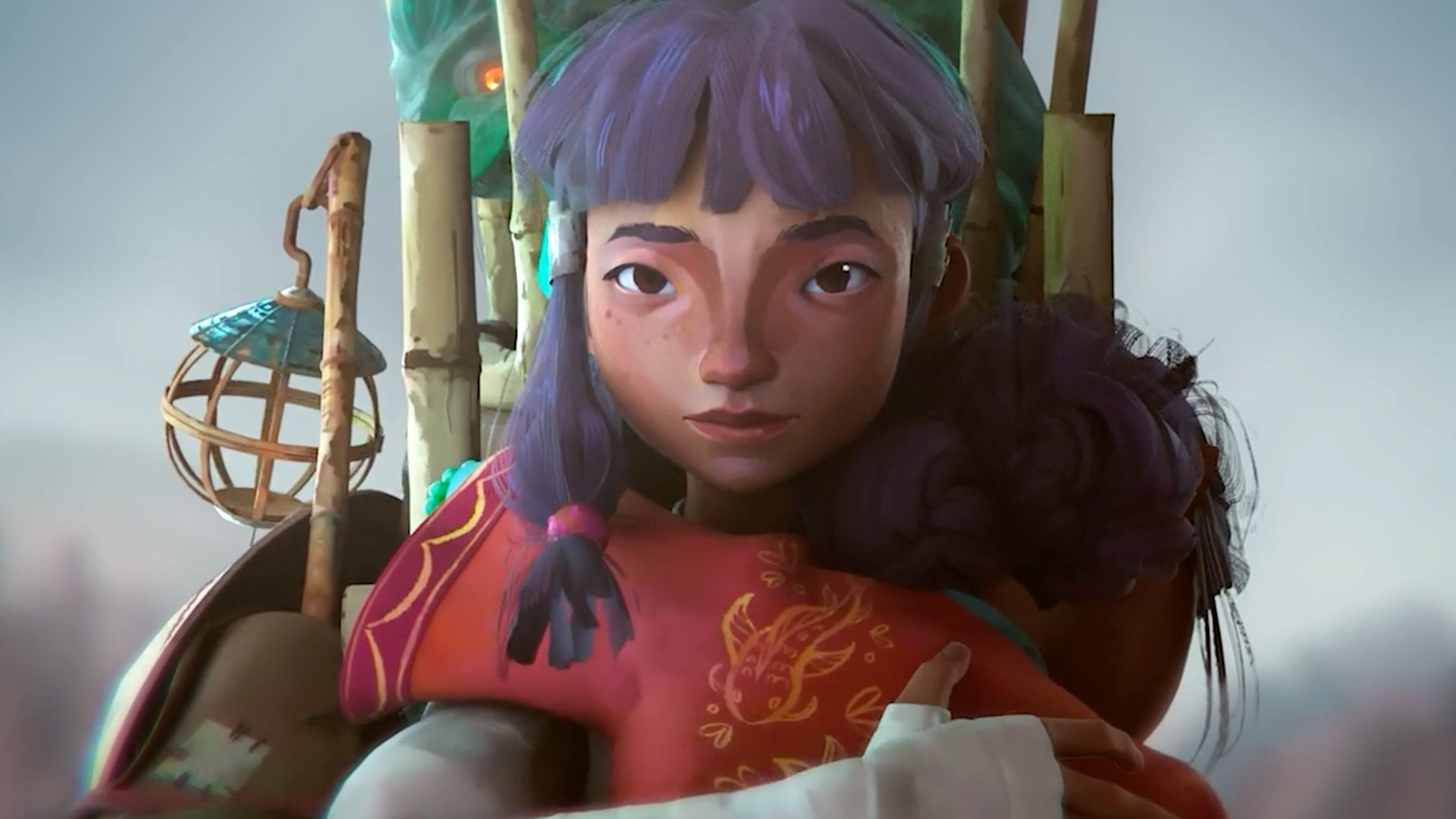
Channel 4’s promotion for the annual UK steeplechase spectacle known as Crabbie’s Grand National Festival takes a mythological turn as Nexus directors Smith & Foulkes and 4Creative craft a classic adventure/fairytale of “The Outsider,” a unicorn foal with runty wings and a twisted horn, overcoming impossible odds. [Watch]
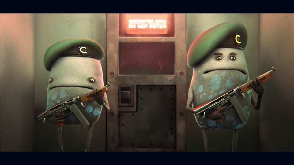
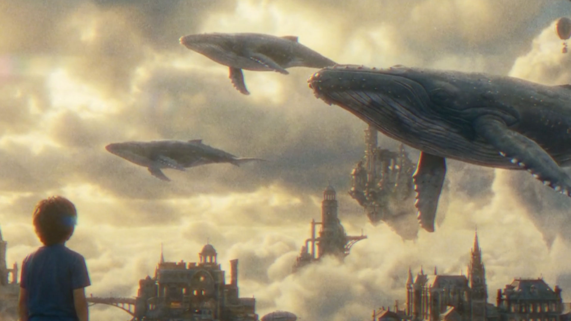
Nexus directors Smith & Foulkes brew up two-minutes of apocalyptic fun for a serious cause in this broadcast and cinema spot boosting awareness for Stand Up To Cancer, the partnership between Channel 4 and Cancer Research UK, billed as a ‘killer night of fundraising.’
Smith & Foulkes: “The initial brief was to turn the table on cancer, depicting the disease as a civilization spreading aggressively – unable to prevent its own Armageddon in the style of a disaster movie.
“The main challenge was how to visualize the cancer cells. We wanted to steer away from the obvious route of showing cells as a bunch of grotesque alien germs, but we were also acutely aware of not making them too human or cute.”
“We also had to find a way to illustrate the new therapies, drugs and scientific breakthroughs that are fighting Cancer. We wanted their arrival to be initially magical and mysterious. so we used a glowing blue orb, an unexplained light descending upon a shadowy world.
“Disaster Movies rely heavily on vast visual spectacle and a cast of thousands, so working within our time constraints we decided to recreate this using 2D matt paintings to show a sense of the city without having to model every building.
“This gave it an illustrative and richly textured feel. Modeling and animating our cast in 3D gave us the flexibility of performance we wanted, and made them stand out from their environment.” [Watch]