Alkemy X Boosts Visual Effects Leadership Team
July 7, 2026
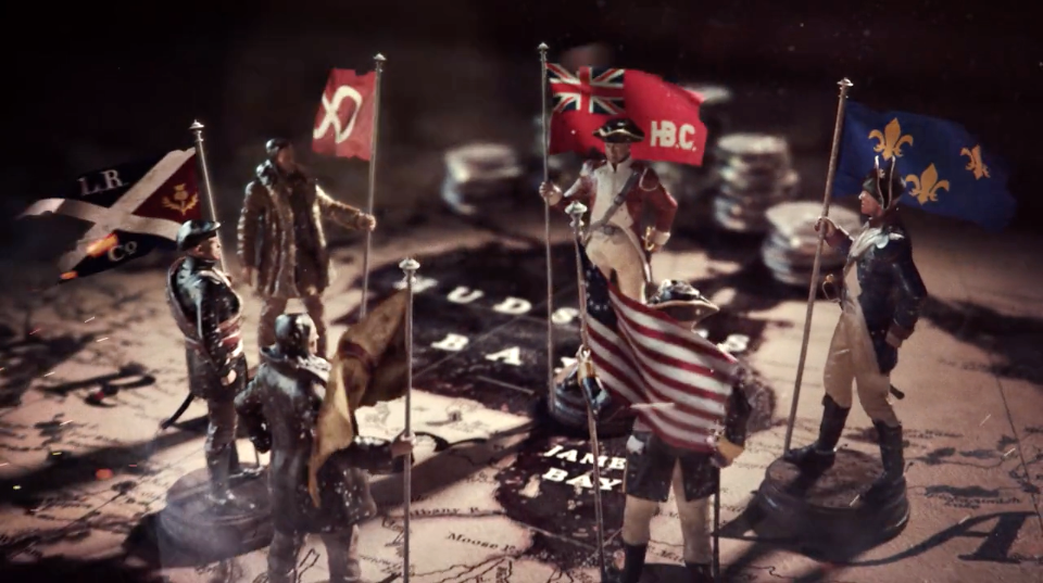
Wonderful dark and textured broadcast work from Toronto design and motion house Iamstatic for the titles of “Frontier,” the Canadian-American historical series chronicling the North American fur trade of the 1700s co-produced by Discovery Channel (Canada) and Netflix. [Watch]

Twelve years and 120 issues later, the Stash Permanent Collection keeps growing – delivering inspiration and insight to subscribers on six continents with access to over 4,400 outstanding design, animation and VFX projects PLUS behind-the-scenes features and exclusive Stash interviews. [Watch]

ECD Orion Tait and the Buck crew in New York conjure a psychotropic intro for David Blaine’s latest magic special (complete with VO by Christopher Walken) reflecting just how disoriented and delighted the audience feels after witnessing Blaine’s low-key but mind-f#cking feats. [Watch]

Join 35 STYLE FRAMES speakers plus an audience full of designers, directors, animators, ADs, CDs, ACDs, ECDs, producers and EPs, HOPs, VPs, SVPs, VFX artists/supervisors, educators, audio and interactive designers plus VR producers, from all sides of the creative industry. [Watch]

Hold onto your memes and emojis, Tomás García and his crew in Buenos Aires just sent us this absurd whack of chaos/branding for MTV.OS, aka the scary future of broadcasting that uses A.I. to take over your TV brain. [Watch]
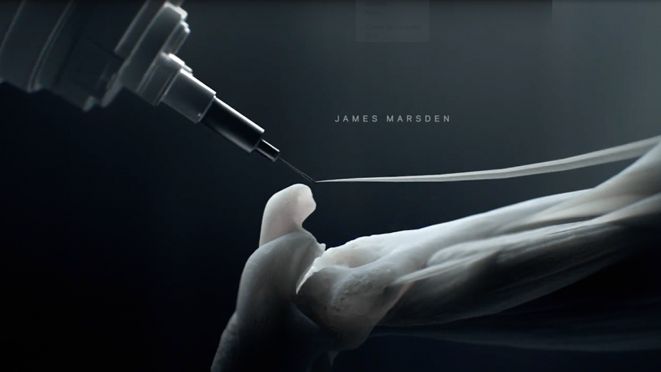
Fresh off his Emmy win for Outstanding Main Title Design on The Man In The High Castle, Elastic director Patrick Clair invokes a touch of future-tech terror pushing 3D printing into beautiful and ominous new territory in these opening credits from Episode 1 of Westworld on HBO. [Watch]