Alkemy X Expands With Toronto Studio
July 14, 2025

Pre-show theatre announcements in Brazil got a whole lot more intricate and interesting recently with the introduction of this ambitious mix of CG and miniatures from São Paulo production powerhouse Vector Zero. [Watch]

Packed with both adrenalin and atmosphere, this CG trailer – produced in collaboration with Ubisoft Paris for Tom Clancy’s Ghost Recon: Wildlands – moves Paris studio Mathematic firmly into the top tier of game promotion. [Watch]
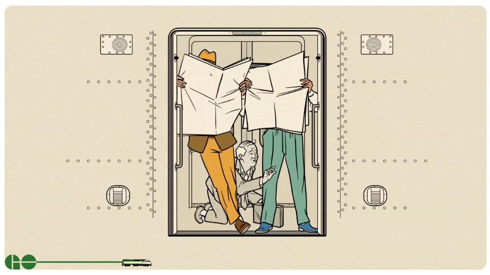
Montreal studio Fluorescent Hill taps the deep well of flight safety card parody to perk up the commute of 250,000 daily riders on GO Transit (Ontario’s public commuter train/bus system), thru agency Tribal Toronto. [Watch]
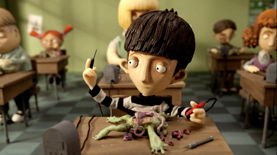
Real-life Canadian animation legend Cordell Barker – creator of Oscar-nominated shorts “The Cat Came Back” and “Strange Invaders” plus hundreds of commercials – takes on the “the difficult gateway between childhood and adolescence” in his latest opus “If I Was God…” [Watch]

I have very good news for all of you who ever had this conversation: “Dude! What if Encyclopedia Pictura made a video game with Kanye!” To which came the reply, “I’m so in. But PROMISE me I get to play as Kanye’s mom flying through the gates of heaven.” [Watch]
London design and motion studio Art&Graft take on the challenge of conveying a character’s emotions without the benefit of facial features in this 3D animated charmer for Costa Sunglasses thru agency McGarrah Jessee. [Watch]